

21 Living Room Color Psychology Ideas That Wow
Color changes how a living room feels: how bright it looks, whether it reads warm or cool, and whether it feels calm or lively. Many links between colors and moods are widely shared, but research on color psychology is still young, so treat them as common associations rather than rules.
Below are 21 living room colors, with the mood each is commonly linked to, what to pair it with and how to use it. Start with the basics, because light and undertone change a color more than any theory does.
What to know before you choose a color
Treat color psychology as a guide
A 2015 review in Frontiers in Psychology describes the research on color and psychological functioning as being at a nascent stage, with many studies too small or poorly controlled. Claims that a paint color lowers blood pressure or relieves stress go beyond the evidence.
Associations are shared, but not fixed
A 2020 study of 4,598 people in 30 countries (Jonauskaite and colleagues, Psychological Science) found that color-emotion associations were broadly similar across nations: red with both love and anger, yellow with joy, black and gray with sadness. Language and culture still shaped them, and your own associations matter too.
Check the light in the room
Sherwin-Williams notes that north-facing rooms get the least light, so cool undertones can look colder there, while south-facing rooms get warm light most of the day. A paint’s light reflectance value (LRV), on a 0 to 100 scale, shows how much light it reflects.
Test large samples
Paint or stick up large swatches on two walls and look at them in the morning, in the afternoon and under lamps before you commit. Small chips rarely show how a color will look across a whole room.
The 21 colors at a glance
| Color | Commonly linked with | Pairs with | Best used as |
|---|---|---|---|
| Warm white | Calm, openness | Wood, linen | Walls and ceiling |
| Navy | Stability, formality | Brass, tan leather, cream | Walls or one accent wall |
| Sage green | Nature, rest | Wood, cream, terracotta | Walls or built-ins |
| Terracotta | Warmth, earthiness | Cream, olive, rattan | Accent wall, textiles |
| Blush pink | Softness, comfort | Gray, brass, white stone | Walls or textiles |
| Charcoal | Depth, seriousness | Wood, cream, brass | Walls, with layered lighting |
| Mustard | Cheer, energy | Charcoal, teal, navy | Accents |
| Lavender | Rest, softness | Gray, warm white, linen | Walls |
| Forest green | Nature, richness | Camel, dark wood, brass | Walls or built-ins |
| Warm beige | Comfort | Oatmeal, caramel, jute | Walls, large furniture |
| Coral | Energy, friendliness | Navy, white, wood | Accents |
| Black | Drama, focus | Amber light, velvet, brass | Walls in a well-lit room |
| Sky blue | Calm, freshness | White, natural fibers, light wood | Walls |
| Burnt orange | Warmth, sociability | Chocolate, teal, cream | Chairs, rugs, one wall |
| Dusty rose | Warmth, softness | Warm gray, sage, antique gold | Sofa or curtains |
| Teal | Richness, balance | Mustard, wood, cream | Accent wall |
| Warm taupe | Calm, neutrality | Soft white, black accents | Walls, upholstery |
| Burgundy | Richness, formality | Dark wood, brass, cream | Velvet sofa or one wall |
| Pale aqua | Freshness, lightness | Sand, white, weathered wood | Walls in small rooms |
| Olive green | Earthiness | Leather, walnut, wool | Walls |
| Copper | Warmth, glow | Navy, charcoal, green | Metal accents |
1. Warm White for Calm Openness
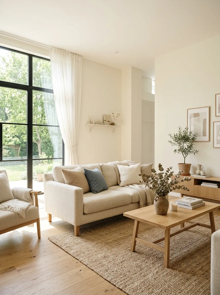
A warm white with a creamy or ivory undertone reflects plenty of light without the stark, clinical look of a very cool white. Pale walls tend to make a room feel more open and give a quiet background with little visual clutter. Pair it with natural wood, linen and a few chosen objects; for more ways to style a white living room, see our full guide.
Good to know: whites change a lot with light and undertone, so compare two or three samples on the wall next to your trim and floor. In a north-facing room, a white with a warm undertone usually looks less gray.
2. Deep Navy Blue for Sophistication
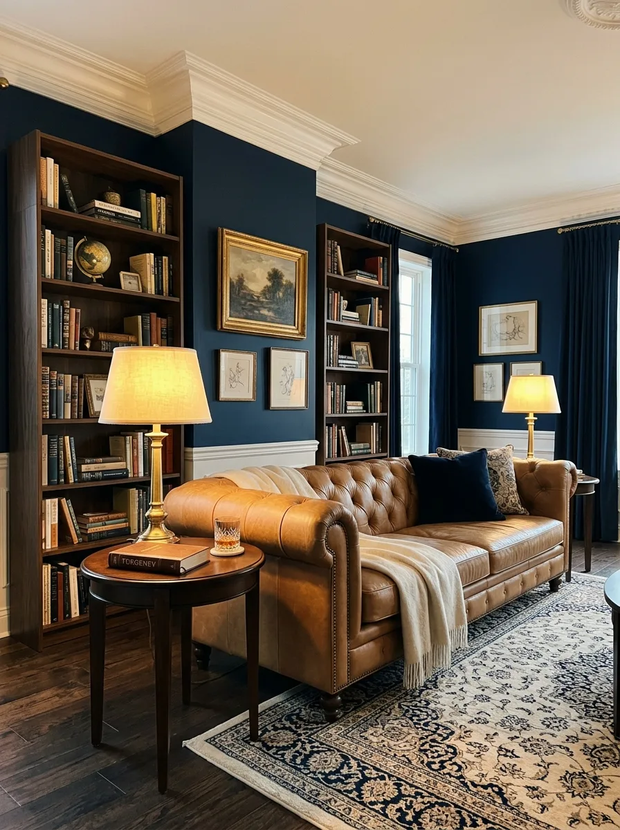
Navy is commonly linked with stability and formality, and in a living room it reads as rich and enclosing rather than bright. Use it on all four walls with white trim, or on one wall behind the sofa. Brass, tan leather and cream fabrics warm it up; for more combinations like this, see these luxury living room color palettes.
Good to know: navy looks much darker in a dim room and almost black at night, so plan lamps at several heights. Check the paint’s LRV: the lower the number, the less light the color reflects.
3. Sage Green for Natural Tranquility
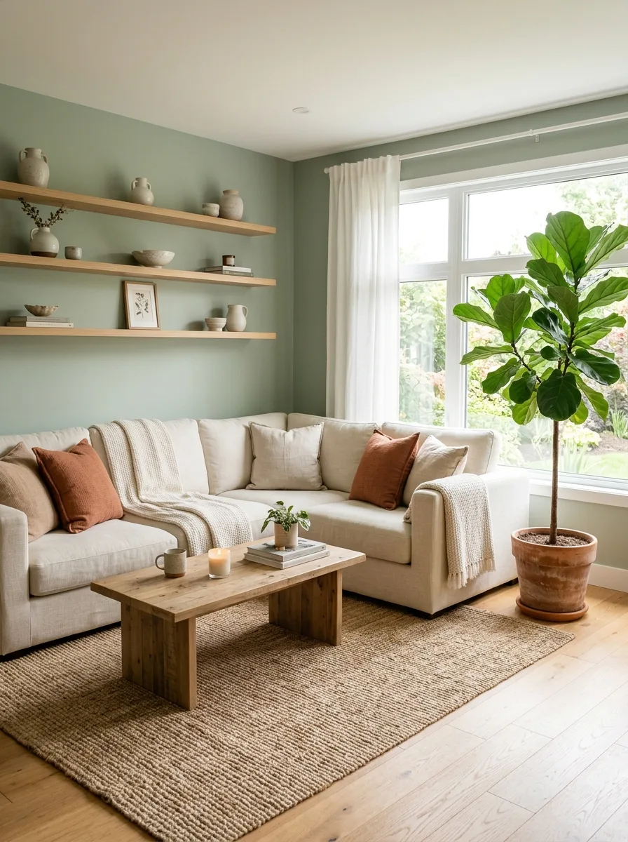
Sage is a muted gray-green that many people associate with nature and rest. Because it is soft and slightly gray, it sits easily with warm wood, cream fabrics, terracotta and black metal. Use it on the walls for a calm background, or on built-in cabinets and shelves if you prefer white walls.
Good to know: sage can turn gray in a north-facing room and look mintier in strong daylight, so test samples on more than one wall. Real plants add the natural feel that the color only suggests.
4. Terracotta for Grounded Warmth
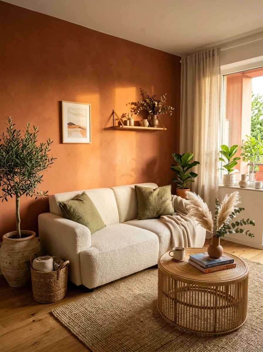
Terracotta is a warm orange-brown that recalls clay pots and floor tiles, and it is often described as earthy and grounding. A terracotta accent wall, rug or set of cushions warms a neutral room quickly. Pair it with cream, olive green and natural textures such as rattan, jute and linen for a Mediterranean feel.
Good to know: warm colors like terracotta glow in south- and west-facing light but can look darker and duller in a dim north-facing room. If your room is dark, try the color in textiles first.
5. Soft Blush Pink for Gentle Energy
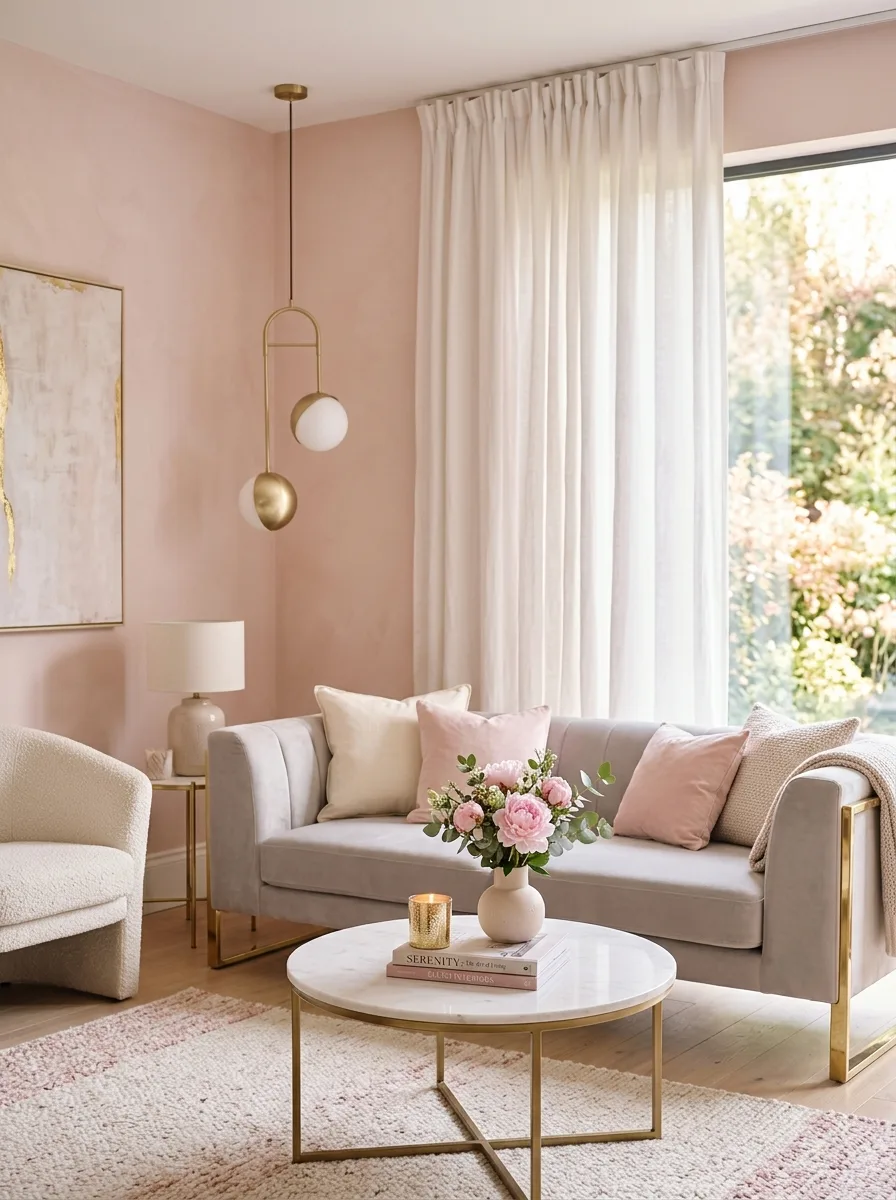
Soft blush pink adds warmth without the intensity of a bright pink, and it is light enough to use on every wall. It looks current with gray or cream upholstery, brass lighting and white stone. Choose a muted blush with a hint of beige or gray so it reads as a warm neutral rather than a nursery pink.
Good to know: the popular idea that pink calms aggression comes from research on ‘Baker-Miller pink’, but a controlled 2015 study by Genschow and colleagues did not replicate the effect. Choose pink because you like it, not as a mood treatment.
6. Charcoal Gray for Modern Depth
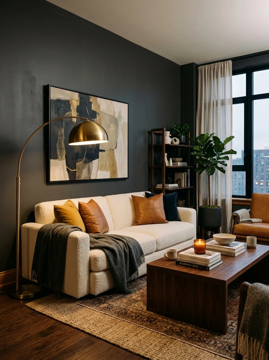
Charcoal is a deep gray that gives a living room depth and a quiet, serious mood without the starkness of black. It suits rooms used mostly in the evening. Warm it with wood, cream throws and brass or copper metal, and use table lamps, floor lamps and candles so the room doesn’t feel dim.
Good to know: grays with a blue undertone can feel cold, so in a room with little sun choose a charcoal with a warm brown or green undertone. Dark paint shows scuffs, so use a scrubbable finish.
7. Mustard Yellow for Optimistic Energy
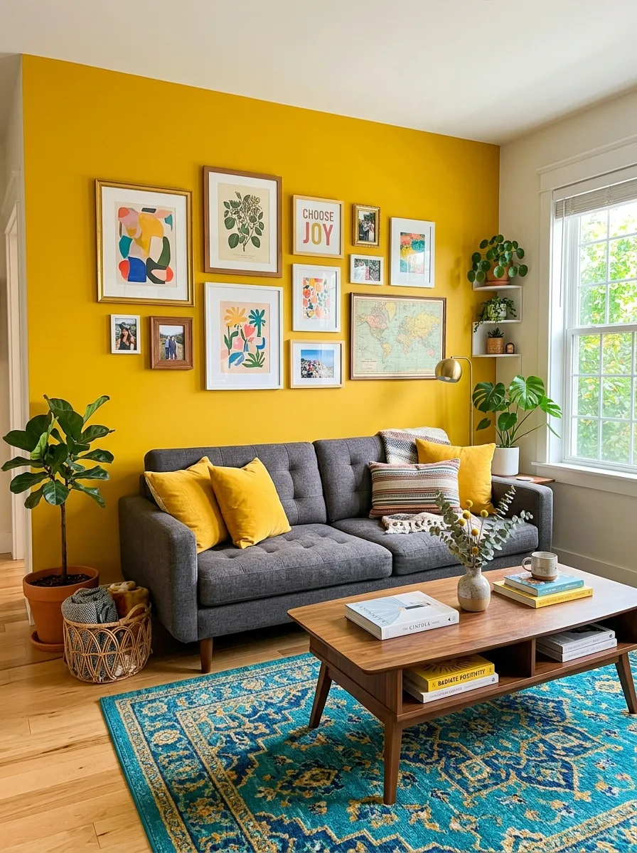
Mustard is a deep, warm yellow. Yellow is widely linked with joy, and the 30-country study above found that association broadly shared. Mustard is softer than lemon yellow, so it is easier to live with. Use it on cushions, a velvet armchair or one wall, and pair it with charcoal, teal or navy.
Good to know: a large area of strong yellow can feel intense, so live with a sample board in the room for a few days before painting a whole wall.
8. Soft Lavender for Restful Relaxation
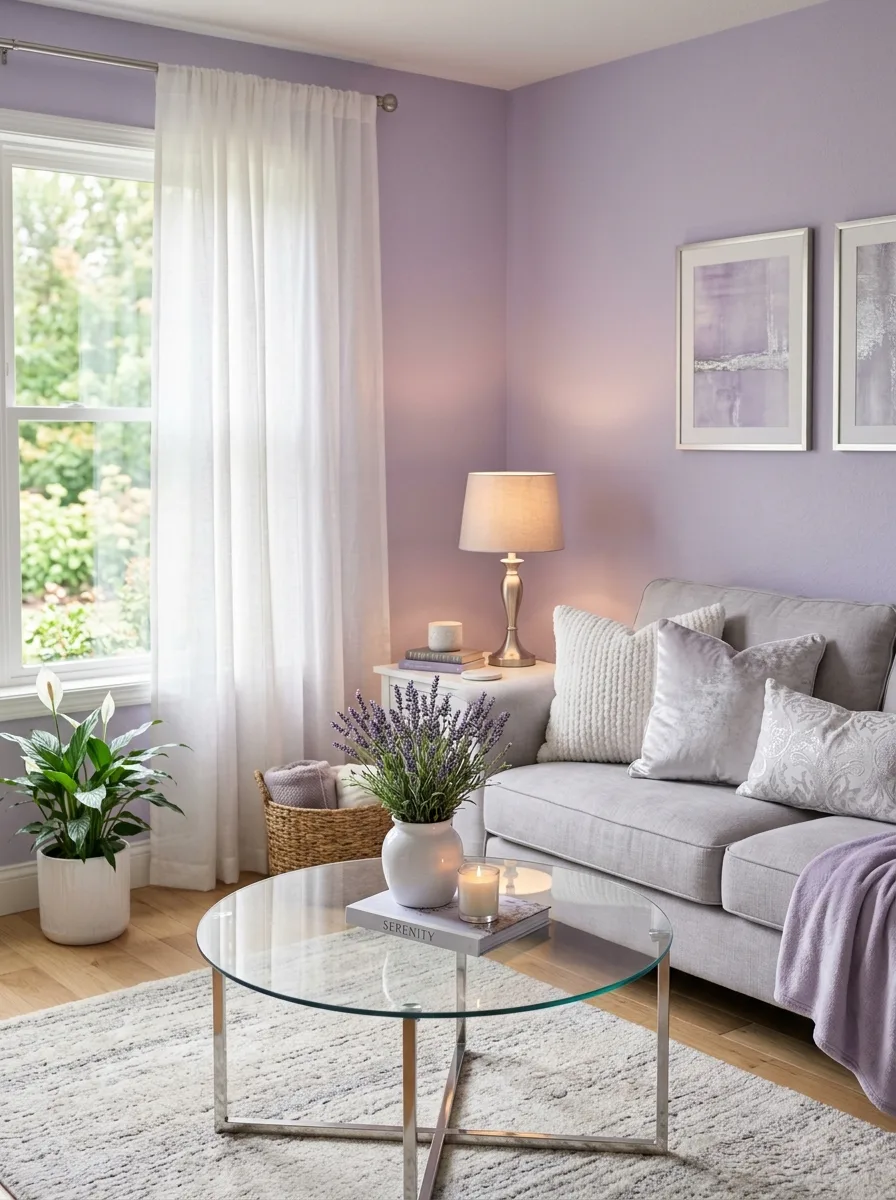
Soft lavender is a pale purple with a gray lean that many people find restful, and it works as a light wall color in place of white or gray. It pairs well with soft gray, warm white and natural linen, and silver or brushed nickel hardware suits its cool undertone. Add wood or brass if it starts to feel too cool.
Good to know: lavender can look gray in north light and pinker in warm light, so compare samples at different times of day. A version with some gray in it looks more grown-up.
9. Forest Green for Bold Sophistication
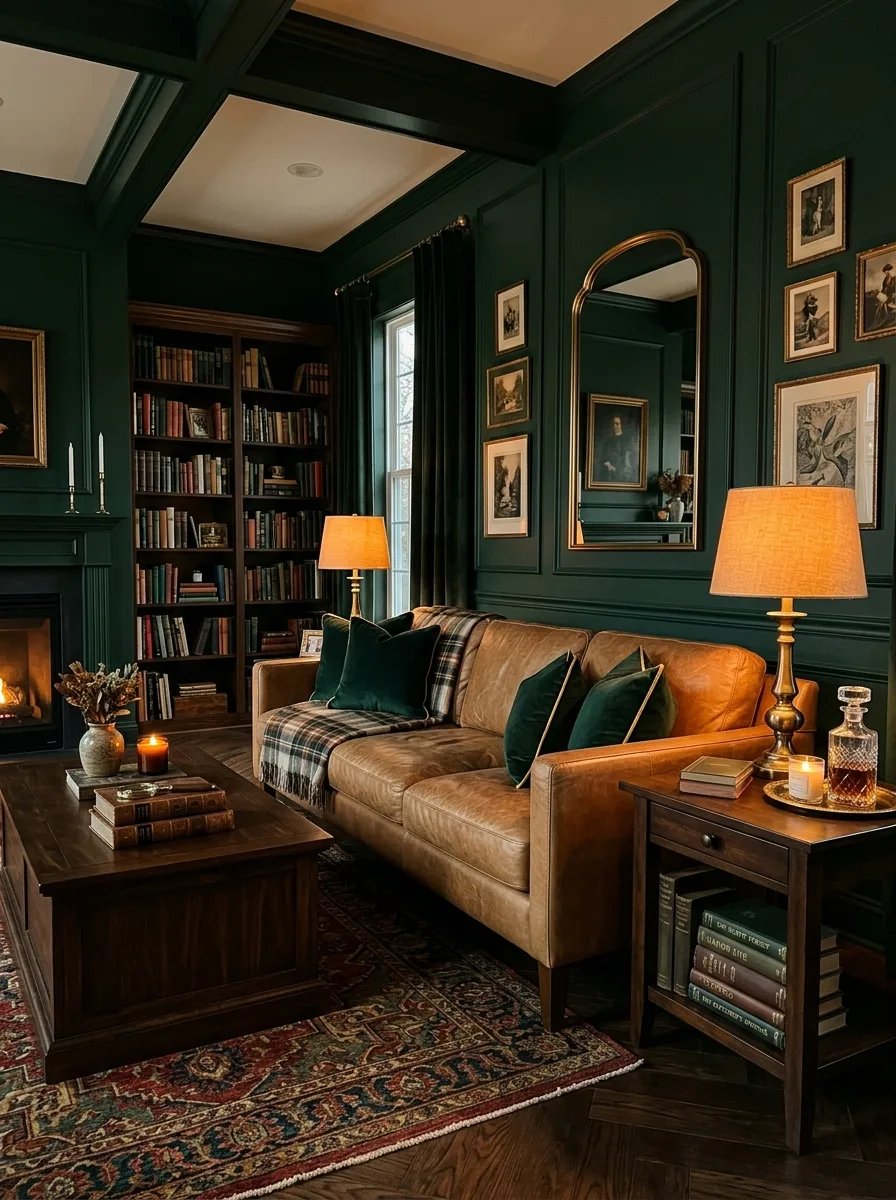
Forest green is a deep, saturated green that many people link with nature and richness. On all four walls it creates an enclosed, cozy room, especially with camel leather, dark wood shelves and brass lamps or frames. It also works on built-in cabinets or bookshelves set against paler walls.
Good to know: deep greens absorb a lot of light, so the room will need more lamps than a pale one. Painting the trim in the same green, or a slightly lighter tint, can look more finished than stark white.
10. Warm Beige for Relaxed Comfort
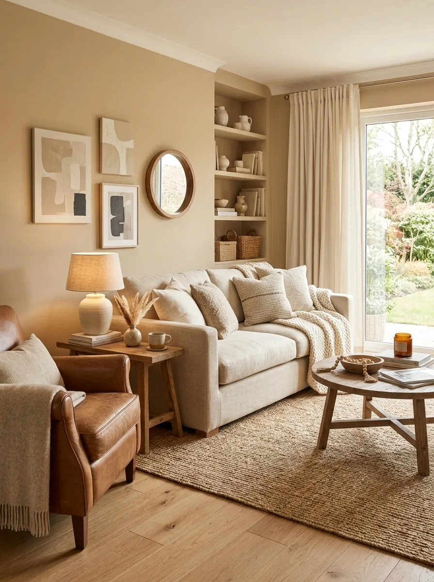
Warm beige is a soft, easy neutral that most furniture and woods sit comfortably against. Keep it from looking flat by layering tones and textures in the same family: sandy walls, an oatmeal linen sofa, caramel leather and a jute rug. If the living room opens to the kitchen, carry the scheme through with these warm neutral kitchen colors.
Good to know: beige can lean pink, yellow or green depending on its undertone, so hold samples against your floor, sofa and trim before choosing.
11. Coral for Energetic Warmth
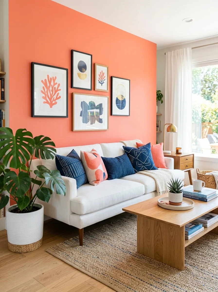
Coral mixes pink and orange, and it is lively enough that most rooms use it in small amounts. Cushions, a piece of art, a throw or one accent chair add energy without taking over the room. Navy and coral make a strong contrast; soft white and warm wood keep the look lighter.
Good to know: bright fabrics fade in direct sun, so keep coral textiles out of the strongest light or choose fade-resistant fabrics. Small accents are also easy to swap if you tire of the color.
12. Midnight Black for Dramatic Elegance
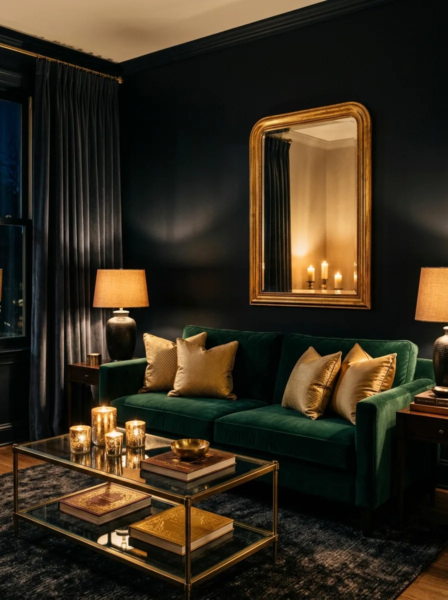
Black walls make a living room feel enclosed and dramatic, and lit objects, art and texture stand out against them. Black works best in a room with good daylight or one used mostly at night. Warm amber lighting, jewel-toned velvet and brass or gold accents keep it inviting rather than gloomy.
Good to know: black paint absorbs most of the light that hits it, so plan several lamps and dimmers. A soft black with a hint of brown or green feels warmer than a pure jet black.
13. Sky Blue for Peaceful Clarity
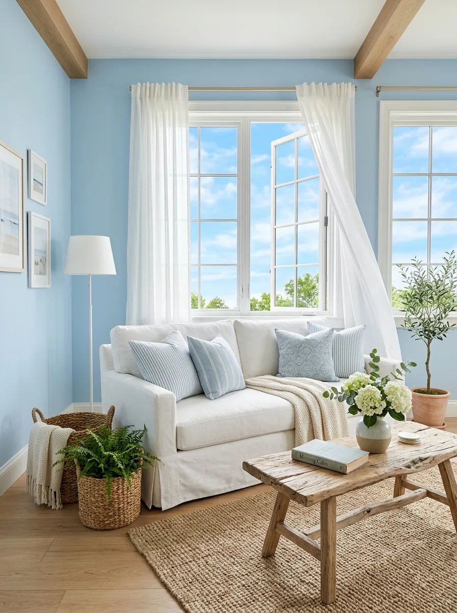
Sky blue is a light, clear blue commonly associated with open skies and calm. It works well in rooms with large windows, where daylight keeps it airy. Pair it with white woodwork, natural-fiber rugs and light wood furniture for a relaxed coastal look.
Good to know: light blues can look cold in north-facing rooms. Choose a blue with a touch of gray or green there, and balance it with warm wood and textiles.
14. Burnt Orange for Creative Stimulation
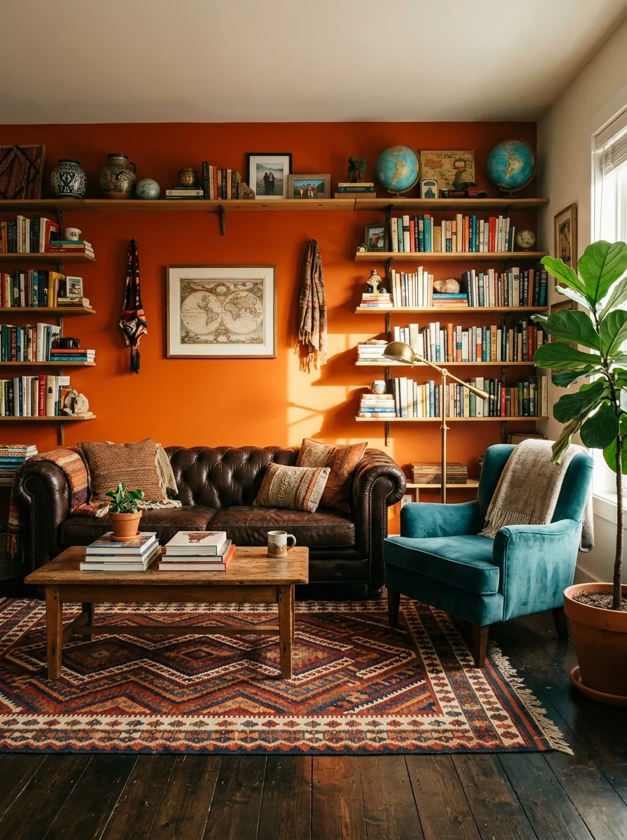
Burnt orange is a deep, warm orange, bolder than terracotta and softer than bright orange. Orange is often described as sociable and energetic, which suits a room used for gatherings. Try it on a pair of armchairs, a rug or one wall, and pair it with chocolate brown, deep teal and cream.
Good to know: try burnt orange in fabric before paint. It is a strong color, and a velvet or wool chair lets you see how it looks in the room’s light without repainting.
15. Dusty Rose for Understated Romance
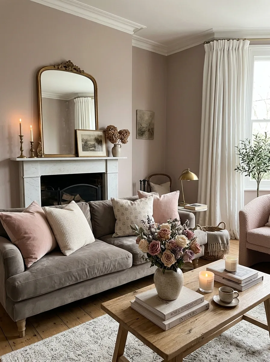
Dusty rose is a muted pink with a gray or brown undertone, so it reads warmer and more grown-up than a sweet pink. A dusty rose sofa against warm white walls, or curtains in the same shade, adds color without taking over. It pairs well with warm gray, sage green and antique gold.
Good to know: curtains take the most sun in a room, so choose lined curtains or a fade-resistant fabric to keep the color even.
16. Teal for Balanced Vibrancy
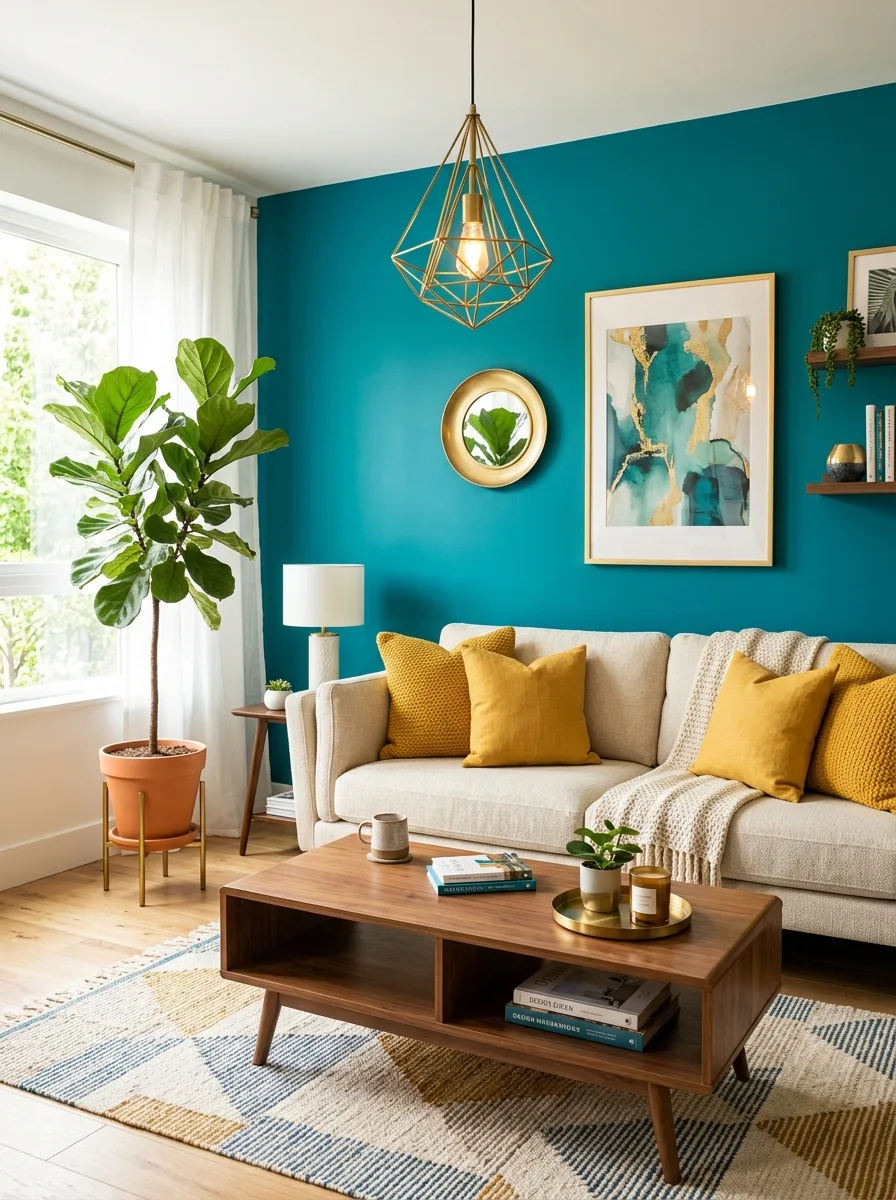
Teal sits between blue and green, so it feels rich but less cold than a pure blue. A teal wall behind a neutral sofa gives the room a clear focal point. Mustard and coral accents contrast well with teal, and warm wood and cream textiles keep the room approachable.
Good to know: teal can shift toward blue or green depending on the light, so test a large sample next to the sofa fabric you plan to use with it.
17. Warm Taupe for Quiet Elegance
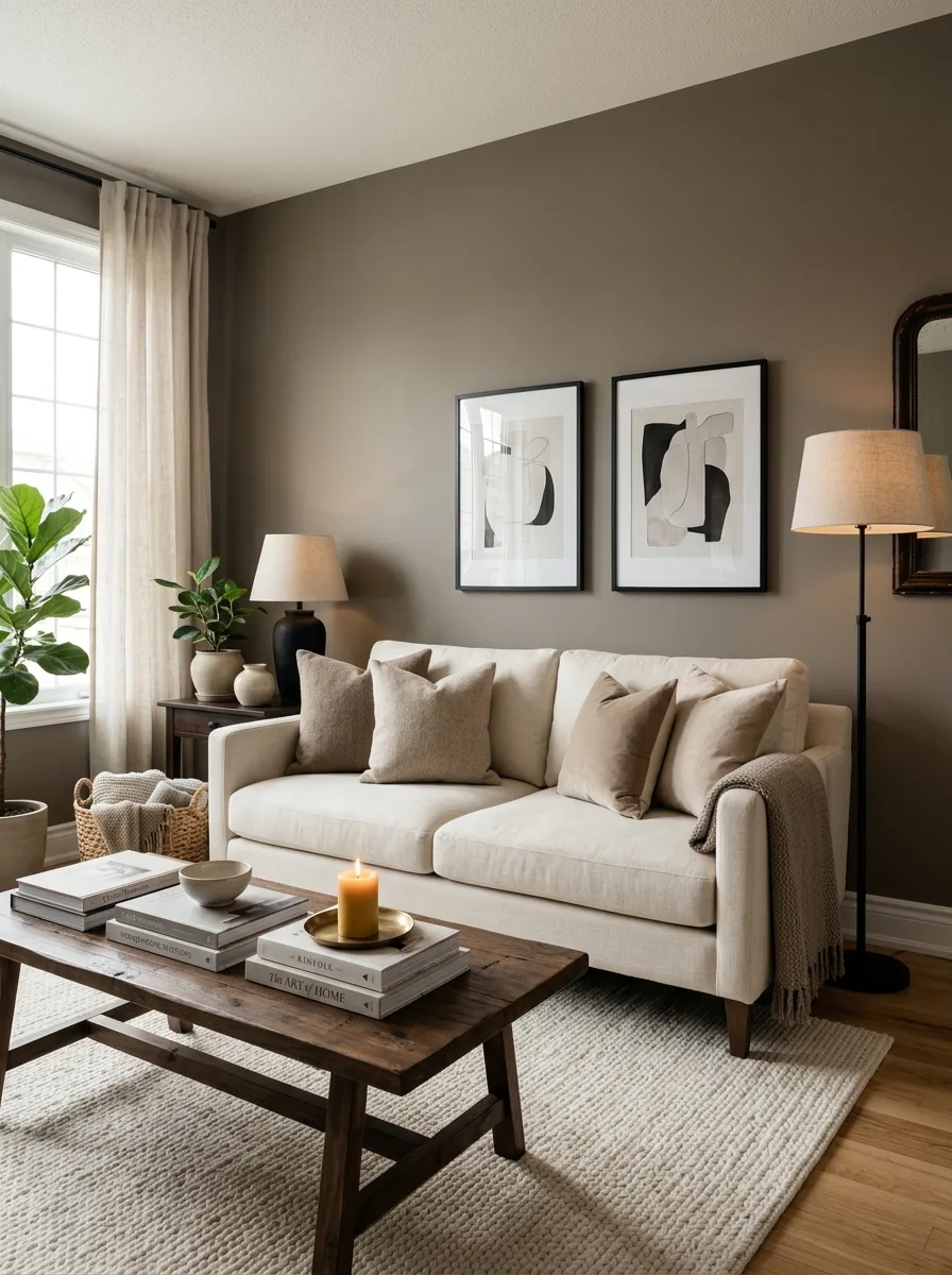
Warm taupe is a neutral between gray and brown, warmer than gray and more muted than beige. It works on walls, upholstery or a rug, and suits rooms meant for relaxing and conversation. Layer several shades of taupe with soft white and a few black accents for a calm, tonal scheme.
Good to know: taupe can lean purple, pink or green. Hold samples against a plain white sheet of paper to see the undertone, then check them in the room.
18. Rich Burgundy for Intimate Luxury
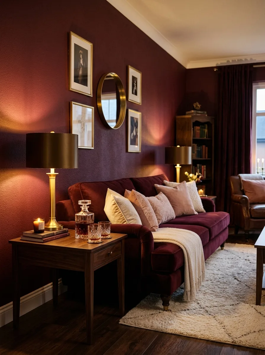
Burgundy is a deep wine red. Red is linked with both love and anger in the cross-cultural research, but a dark, muted burgundy feels richer and calmer than bright red. A burgundy velvet sofa or one painted wall is usually enough; pair it with dark wood, brass and cream or blush accents.
Good to know: deep-colored velvet shows fading and wear in strong sun, so place a burgundy sofa away from direct sunlight or choose a performance velvet made to resist fading.
19. Pale Aqua for Refreshing Serenity
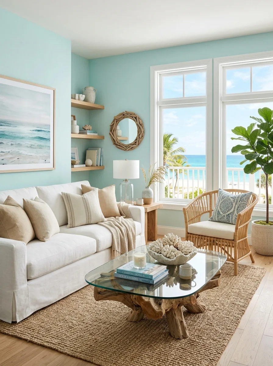
Pale aqua is a light blue-green that recalls sea glass and shallow water, and many people find it fresh and light. Because pale colors reflect more light, it can help a small living room feel more open. Pair it with sandy beige, crisp white and weathered wood for a relaxed coastal palette.
Good to know: check the LRV on the paint chip: pale colors with a higher number reflect more light, which helps in a small or dim room.
20. Olive Green for Earthy Sophistication
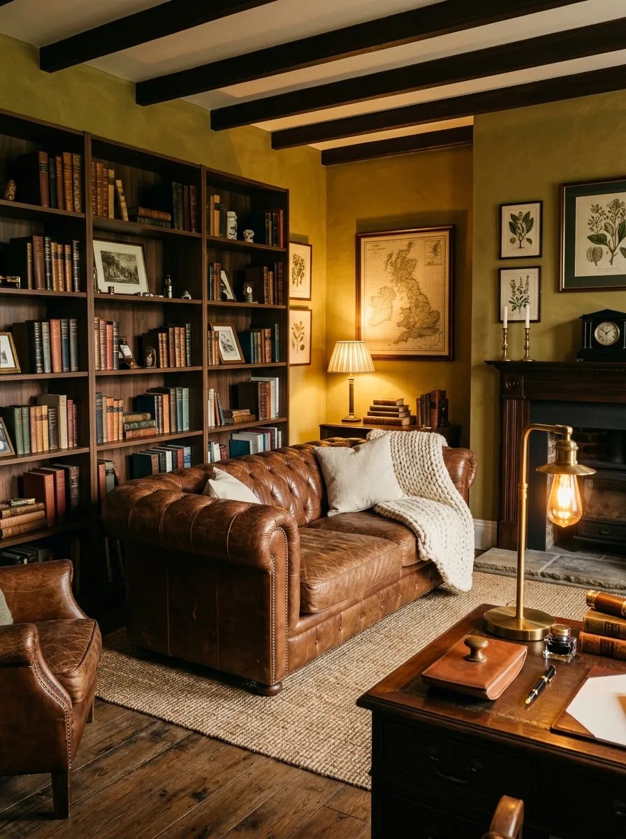
Olive green is a muted green with a yellow-brown undertone, warmer and earthier than sage. Olive walls with brown leather, walnut and warm lamplight give a room the feel of a study or country house. Wool throws and a jute or wool rug add texture.
Good to know: olive can look drab in low light, so pair it with warm-white bulbs and lighter accents. A sample on the darkest wall shows how it will look at its worst.
21. Warm Copper Accents for Inviting Glow
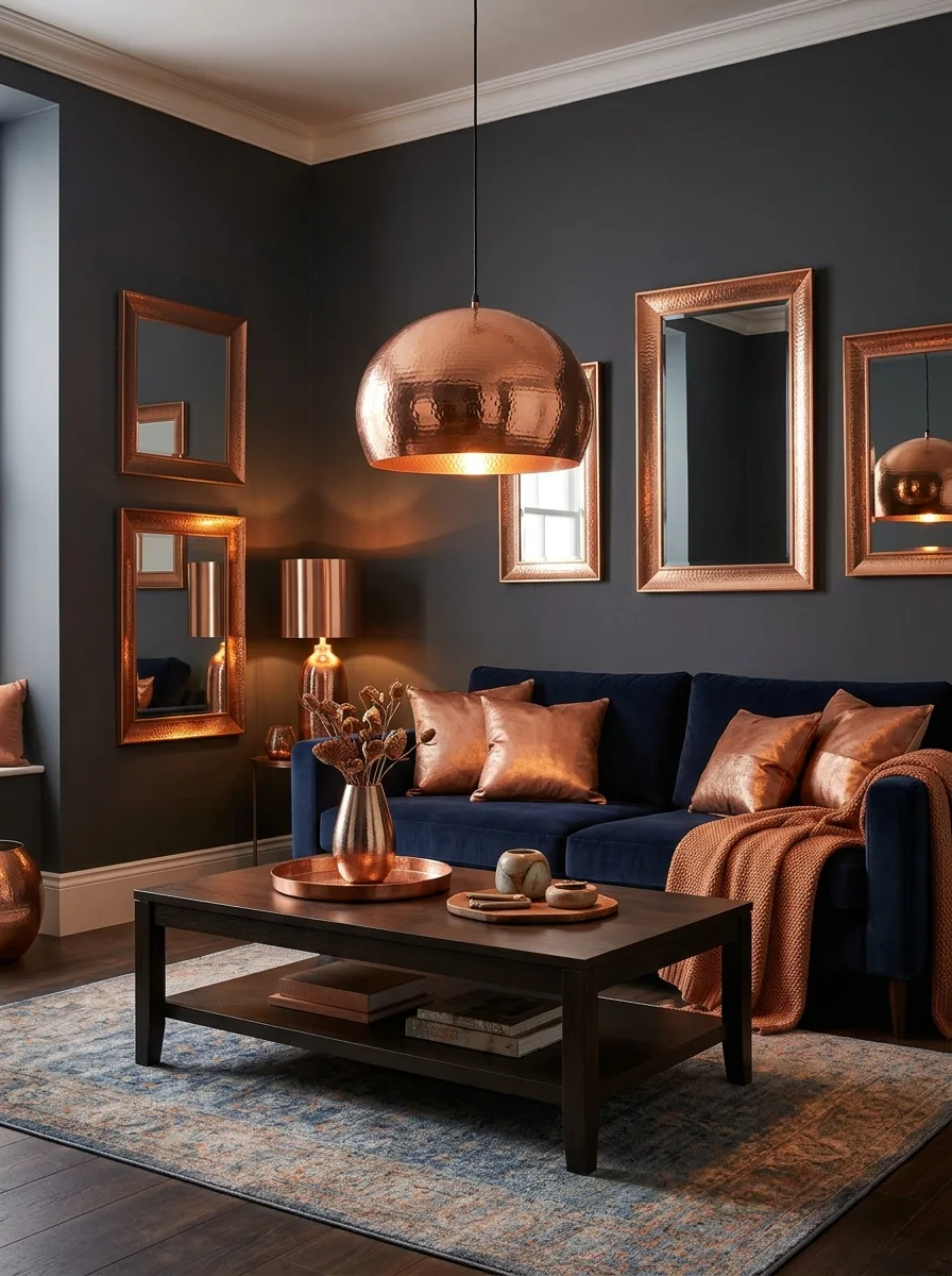
Copper works best as a metal accent rather than a wall color. A copper pendant, mirror frame, lamp base or a few copper-toned cushions add a warm glow because the metal reflects light. It looks rich against deep navy, charcoal or forest green.
Good to know: uncoated copper darkens and develops a patina over time. If you want it to stay bright, choose lacquered pieces, or polish uncoated copper with a cleaner made for it.
Common mistakes to avoid
- Choosing paint from a small chip without testing a large sample in the room.
- Ignoring which way the room faces and how much daylight it gets.
- Believing claims that a paint color lowers blood pressure or stops arguments.
- Using one strong color everywhere instead of balancing it with neutrals.
- Painting walls a dark color without planning enough lamps.
Living room color FAQs
Is color psychology scientifically proven?
Only in part. Many color-emotion associations are widely shared across cultures, but researchers describe the field as young, and claims about health effects go beyond the evidence.
What color makes a living room feel bigger?
Pale colors with a high LRV reflect more light, which tends to make a room feel more open. Keeping walls and trim in similar light tones also helps.
What is the most calming living room color?
Soft, muted colors such as warm white, sage, pale blue and taupe are the ones most often described as calming, but your taste and the room’s light matter more than any rule.
Should a north-facing living room be warm or cool?
Usually warm. Sherwin-Williams advises avoiding cool undertones in north-facing rooms, since they get the least light and cool tones make them look colder.


One Comment