

21 Living Room Color Psychology Ideas That Wow
The colors you choose for your living room do far more than decorate the walls. They shape how you feel the moment you walk through the door, influence how long guests want to stay, and quietly set the emotional tone for every conversation, movie night, and lazy Sunday afternoon spent in that space. Color psychology is the study of how different hues affect human mood, energy, and perception, and when you apply it intentionally to your living room, the results can be genuinely transformative. These 21 living room color psychology ideas will help you design a space that looks stunning and feels exactly the way you want it to.
1. Warm White for Calm Openness
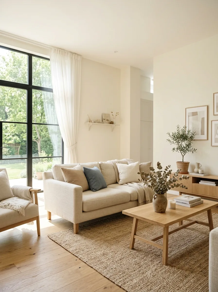
A warm white living room creates a feeling of spaciousness and quiet calm that few other colors can match. Unlike stark cool whites that can feel clinical and cold, a warm white with creamy or ivory undertones wraps the room in soft, welcoming light. It makes ceilings feel higher, walls feel further apart, and the entire space feel peaceful without being boring or lifeless.
The psychology behind warm white is rooted in clarity and simplicity. It reduces visual noise and allows your mind to relax because there is nothing competing for your attention. Pairing warm white walls with natural wood furniture, soft linen textiles, and a few carefully chosen accessories creates a living room that feels like a deep breath every time you enter it.
2. Deep Navy Blue for Sophistication
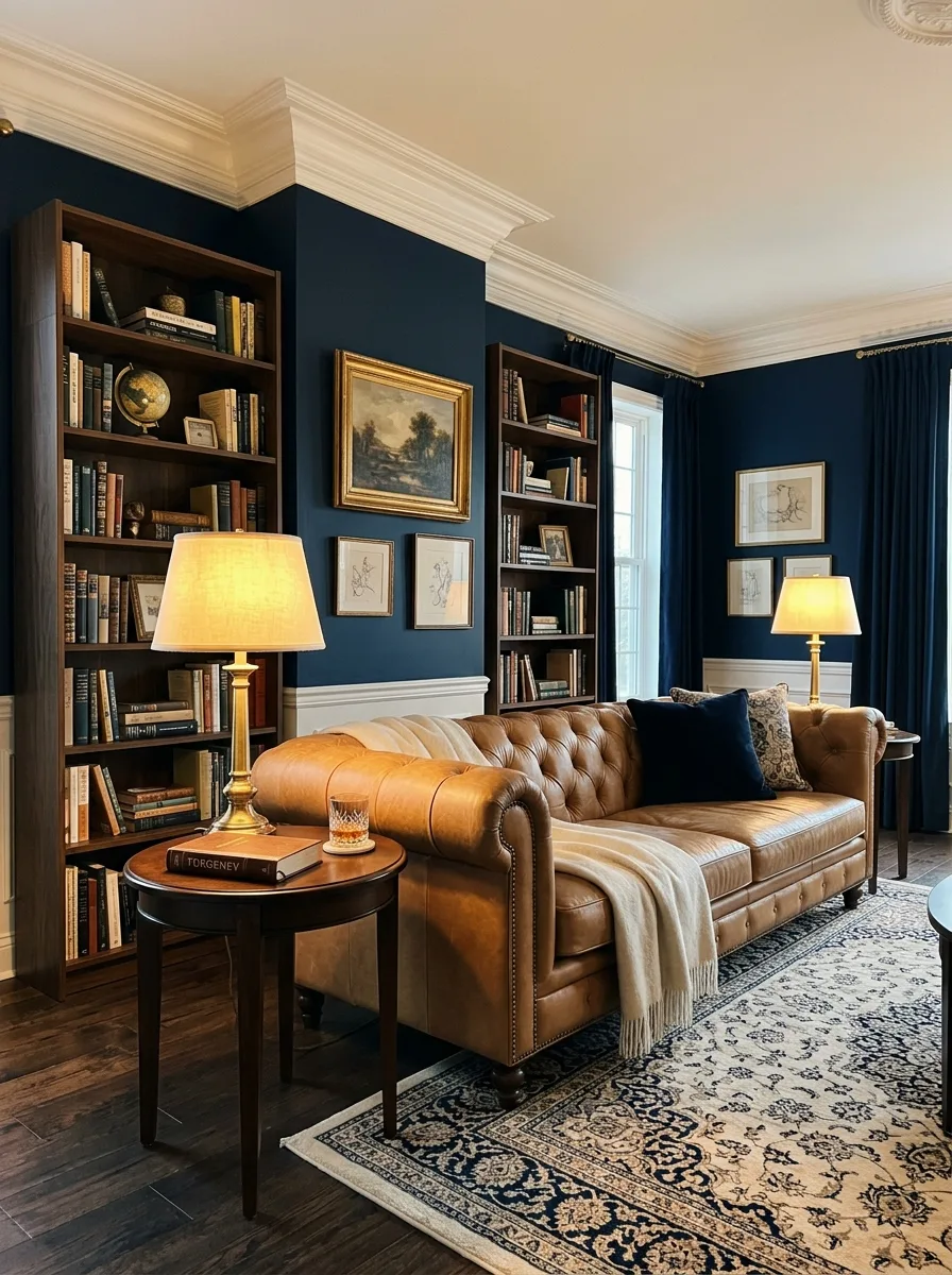
Deep navy blue is one of the most psychologically powerful colors you can use in a living room. It communicates trust, stability, and quiet confidence without feeling heavy or oppressive when applied thoughtfully. A navy accent wall behind a sofa or a fully navy painted room with white trim creates an atmosphere of refined elegance that feels both cozy and impressively polished.
Navy blue works on a psychological level because it slows the mind and encourages a sense of order and calm. It is a color people instinctively associate with depth and intelligence. Pairing navy with brass accents, warm tan leather, and cream colored textiles creates a rich, layered palette that feels like a well curated library or a sophisticated gentleman’s lounge.
3. Sage Green for Natural Tranquility
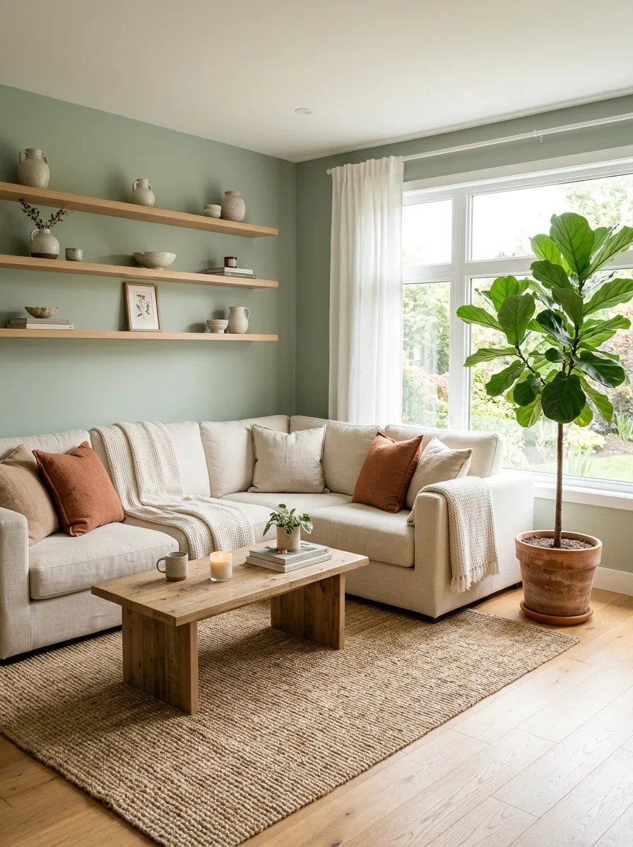
Sage green is a muted, earthy green that brings the calming energy of nature directly into your living room. It is one of the most emotionally soothing colors available, and research consistently shows that green tones reduce stress and promote feelings of balance and renewal. A living room painted in sage green feels like a quiet retreat from the noise and pace of everyday life.
The beauty of sage green is how naturally it pairs with almost every other color and material. Warm wood tones, soft cream fabrics, terracotta accents, and matte black fixtures all sit beautifully alongside sage walls. The color never demands attention or overwhelms the senses. Instead it provides a gentle, grounding backdrop that makes everything else in the room look more intentional.
4. Terracotta for Grounded Warmth
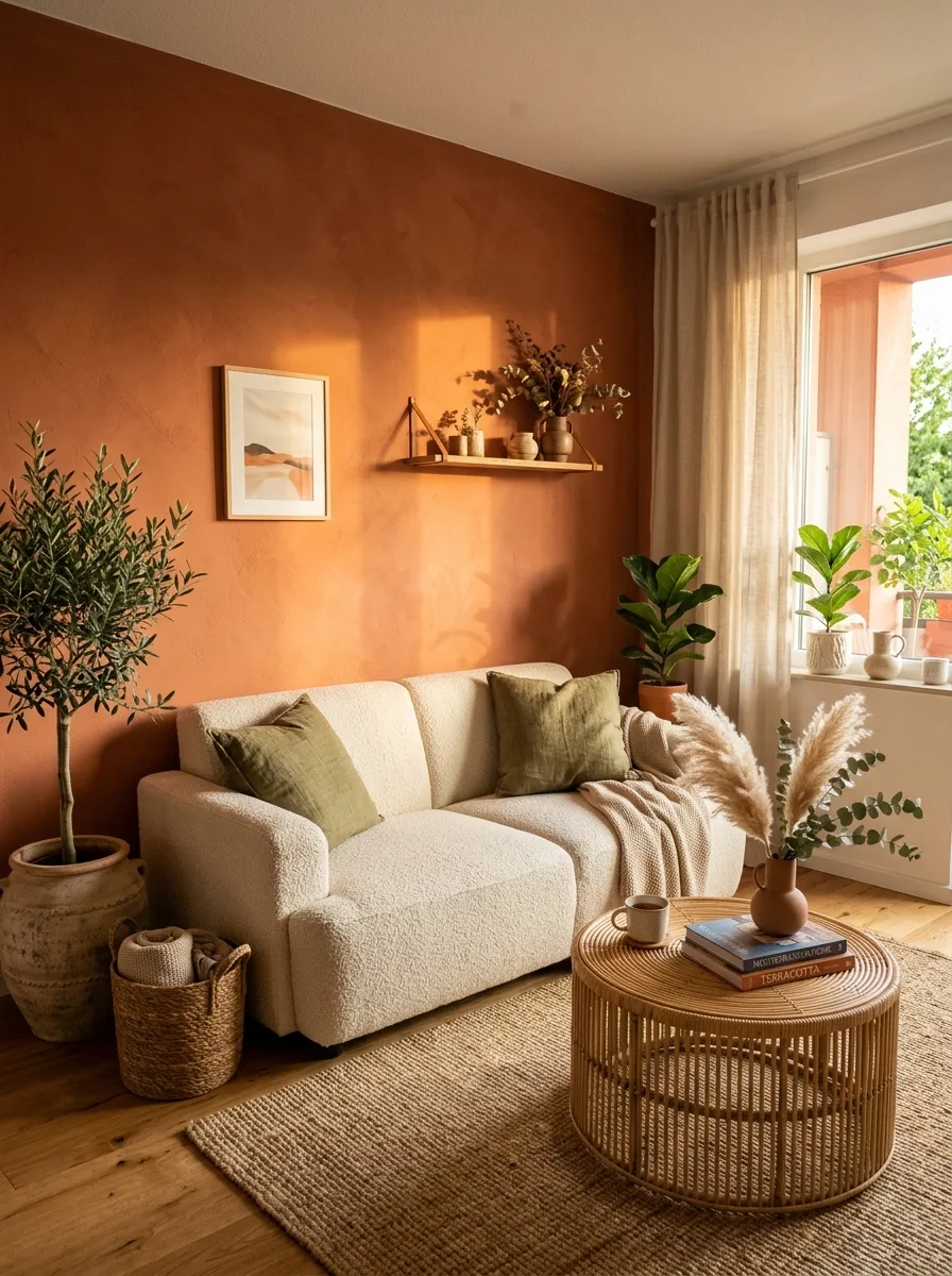
Terracotta is a warm, earthy orange brown that evokes sun baked clay, desert landscapes, and the comfort of handmade pottery. In color psychology, warm earth tones like terracotta are associated with stability, security, and a deep sense of being grounded. A terracotta accent wall or terracotta colored soft furnishings instantly make a living room feel warmer and more emotionally anchored.
This color works especially well in living rooms that receive a lot of natural light, where the sunlight brings out the warm undertones and makes the whole room glow. Pairing terracotta with cream, olive green, and natural rattan or jute textures creates a palette inspired by the Mediterranean and the desert Southwest. It is a color that feels honest, warm, and deeply welcoming.
5. Soft Blush Pink for Gentle Energy
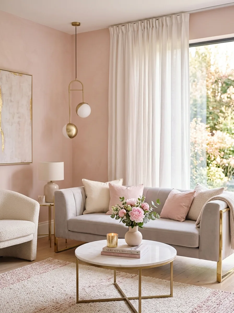
Soft blush pink is a color that radiates gentle warmth and emotional comfort. Unlike bold pinks that demand attention, a muted blush tone is subtle enough to use on every wall without overwhelming the room. Color psychology research suggests that soft pink tones have a calming effect on the nervous system, reducing feelings of anger and agitation and promoting a sense of nurturing warmth.
A blush pink living room feels romantic, soft, and effortlessly modern when paired with the right companion materials. Combining blush walls with gray upholstered furniture, gold or brass lighting fixtures, and white marble or stone accents creates a palette that is sophisticated and inviting at the same time. It is a color that makes people feel comfortable and at ease immediately.
6. Charcoal Gray for Modern Depth
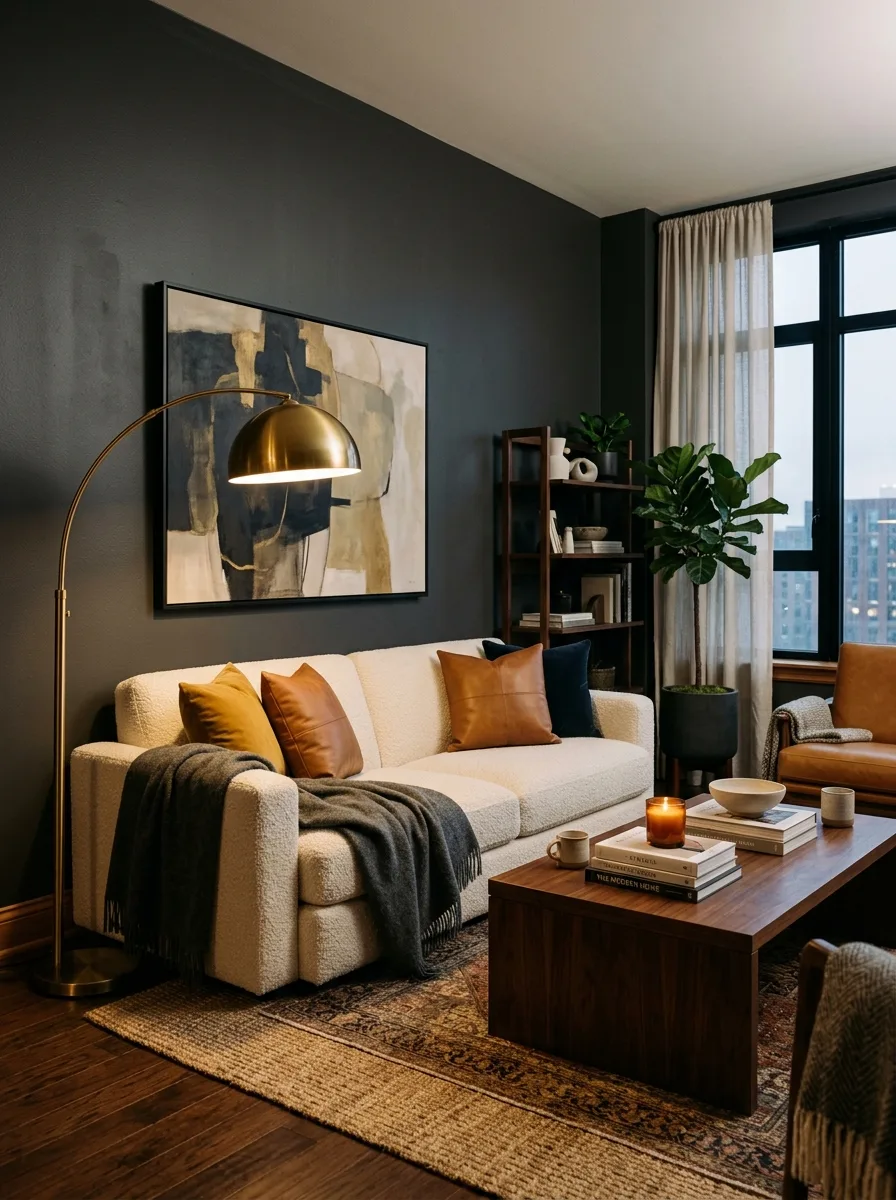
Charcoal gray is a powerful, grounding neutral that adds depth and seriousness to a living room without the starkness of pure black. Psychologically, dark grays communicate strength, composure, and a quiet authority that makes a room feel intentionally designed. A charcoal gray living room feels mature and collected, like a space that belongs to someone who knows exactly what they like.
The key to using charcoal gray successfully is balancing it with enough warmth and texture to prevent the room from feeling cold. Rich wood tones, soft cream throws, and warm metallic accents in brass or copper bring life to the dark walls. Adding plenty of layered lighting with table lamps and candles creates a moody, inviting atmosphere that feels cozy rather than somber.
7. Mustard Yellow for Optimistic Energy
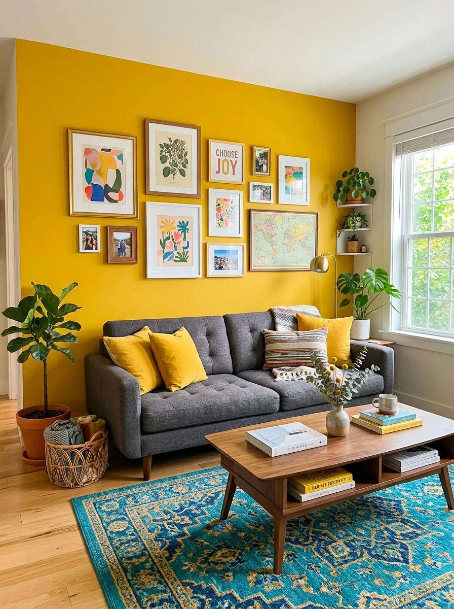
Mustard yellow is a rich, warm shade that brings instant optimism and creative energy into a living room. Unlike bright lemon yellows that can feel harsh and overstimulating, mustard has a deeper, more sophisticated quality that feels both cheerful and grounded. Color psychology connects yellow with happiness, mental stimulation, and confidence, making it a wonderful choice for social spaces.
Using mustard yellow as an accent color through cushions, a statement armchair, or a single feature wall delivers maximum impact without overwhelming the room. Pairing it with charcoal gray, deep teal, or rich navy creates a bold yet balanced color story that feels artistic and full of personality. A living room with touches of mustard always feels alive and energized.
8. Soft Lavender for Restful Relaxation
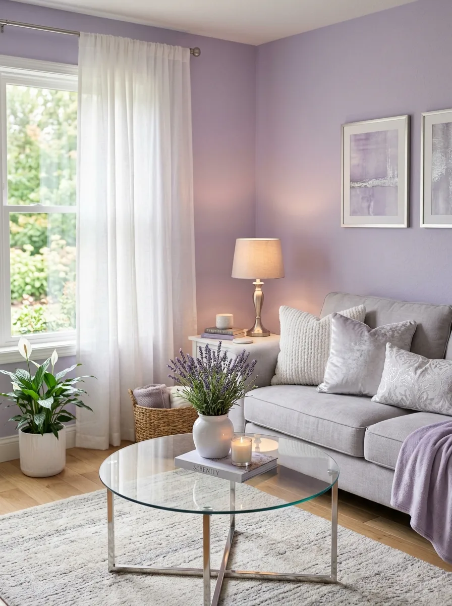
Soft lavender is a light, muted purple that creates a feeling of restful luxury and quiet relaxation in a living room. Purple has long been associated with creativity, spirituality, and introspection, and when softened to a gentle lavender it becomes one of the most calming colors you can put on a wall. It encourages slowing down, deep breathing, and a contemplative state of mind.
A lavender living room pairs beautifully with soft grays, warm whites, and natural linen fabrics to create a space that feels ethereal and dreamy without being overly feminine. Adding touches of silver or brushed nickel in light fixtures and hardware complements the cool undertones of lavender perfectly. This is a color that turns any living room into a place of genuine rest.
9. Forest Green for Bold Sophistication
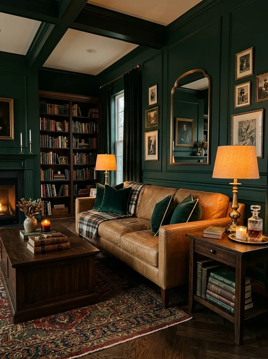
Forest green is a deep, saturated green that brings the richness and depth of a woodland landscape into a living room. It is a color that communicates wealth, growth, and a strong connection to the natural world. Psychologically, deep greens are associated with safety and abundance, making people feel secure and comfortable in a room painted in this powerful, enveloping shade.
A living room with forest green walls creates a dramatic, jewel toned atmosphere that feels luxurious and deeply inviting. Pairing it with camel leather furniture, dark wood shelving, and brass picture frames or lamp bases elevates the look to something genuinely opulent. Forest green is a color for people who want their living room to feel like a private, elegant sanctuary.
10. Warm Beige for Effortless Comfort
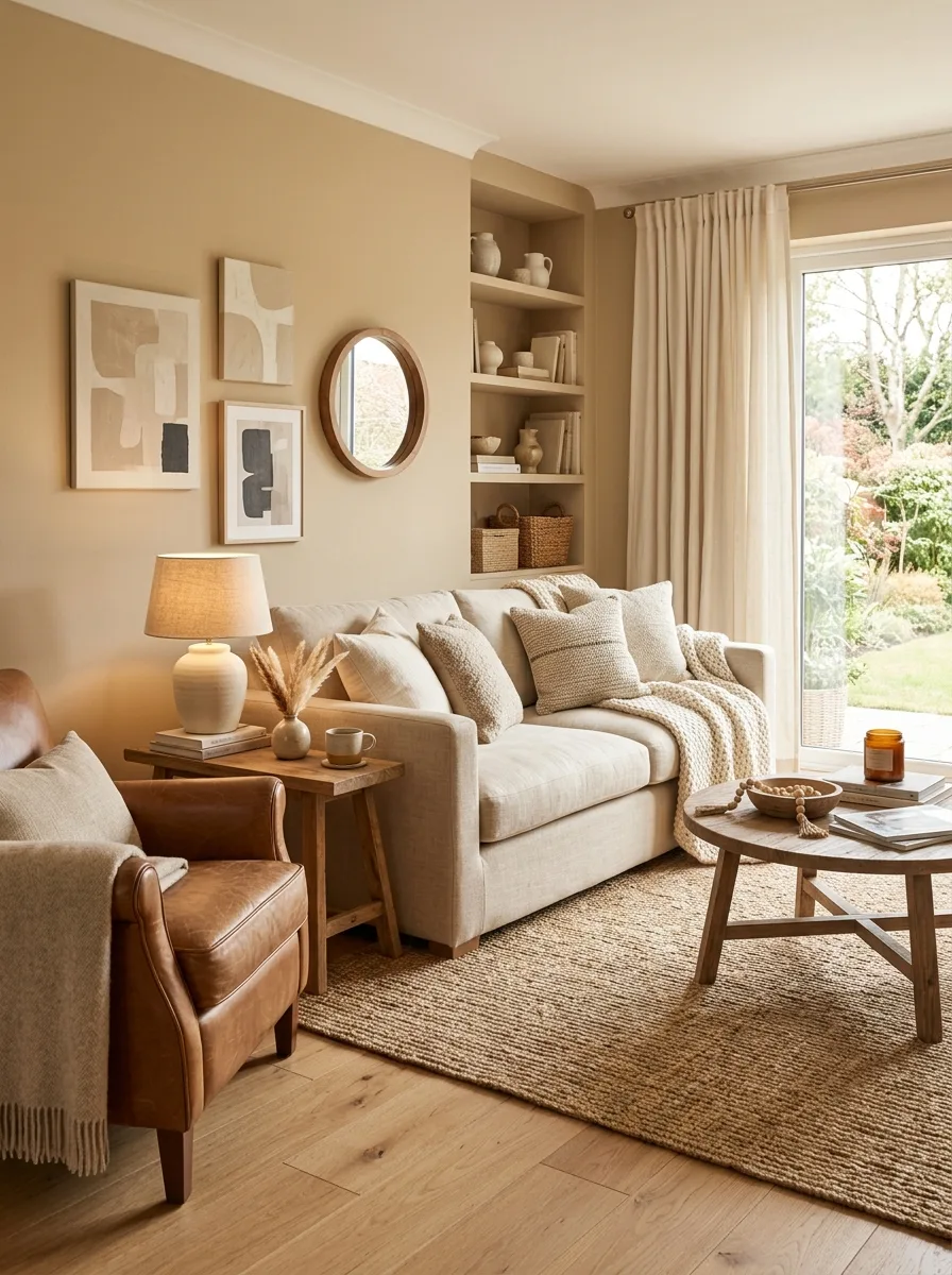
Warm beige is the ultimate comfort color, and its enduring popularity in living room design is no accident. It is a color that wraps around you like a soft blanket, making the room feel safe, familiar, and instantly relaxing. The psychology of beige is rooted in neutrality and warmth, creating a backdrop that never overwhelms and always feels approachable and easy to live with.
The secret to making beige feel modern rather than dated is layering different tones and textures within the same warm palette. Combining sandy beige walls with oatmeal colored linen sofas, caramel leather accents, and natural jute rugs creates a rich, tonal composition that feels intentional and stylish. Beige is not boring when it is used with confidence and textural depth.
11. Coral for Energetic Warmth
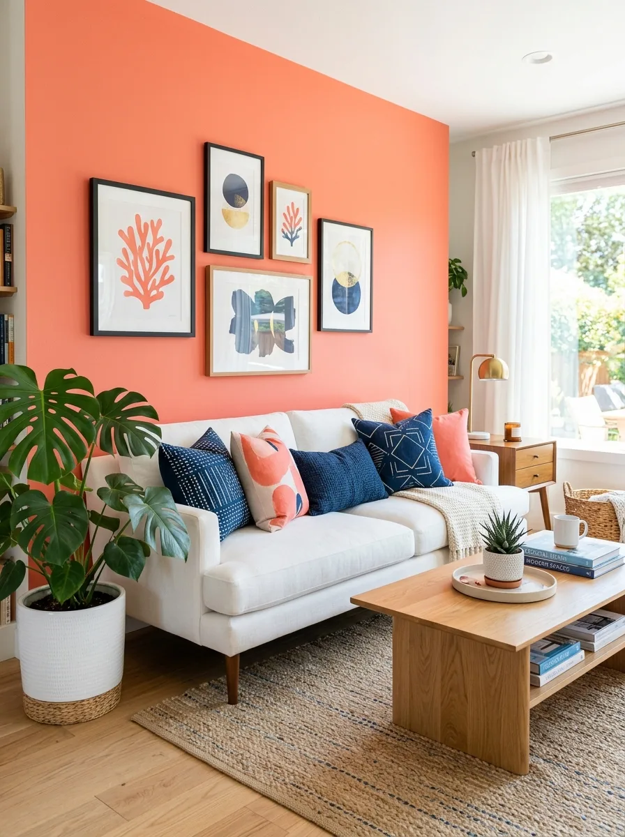
Coral is a vibrant blend of pink and orange that brings playful energy and warmth into a living room. It is a color that makes people smile instinctively because it carries the cheerfulness of orange and the softness of pink in one lively hue. Coral stimulates conversation and social interaction, making it an excellent choice for living rooms where entertaining and gatherings happen often.
Using coral as an accent color through throw pillows, artwork, or a single statement wall adds a burst of personality without overpowering the room. Pairing coral with navy blue creates a striking complementary contrast, while combining it with soft white and warm wood keeps the look fresh and modern. Coral is the kind of color that transforms a room from pleasant to memorable.
12. Midnight Black for Dramatic Elegance
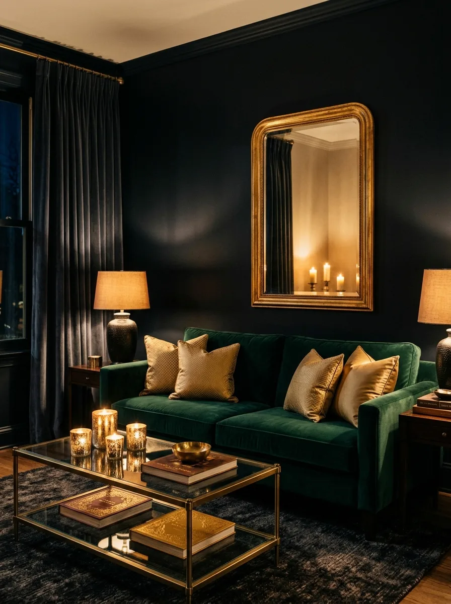
A living room painted in midnight black is a bold design choice that creates an atmosphere of dramatic elegance and cocooning intimacy. Contrary to what many people assume, a dark living room does not feel small or depressing when done correctly. Instead it creates a rich, enveloping space where textures and lighting become more prominent and every element feels more intentional and carefully placed.
The psychology of black in interiors is about creating a sense of protection and focus. In a black room, distractions fade away and the eye is drawn to the things that matter most. Pairing black walls with warm amber lighting, velvet furniture in jewel tones, and gold or brass accents creates a living room that feels like a luxurious evening retreat worthy of lingering in.
13. Sky Blue for Peaceful Clarity
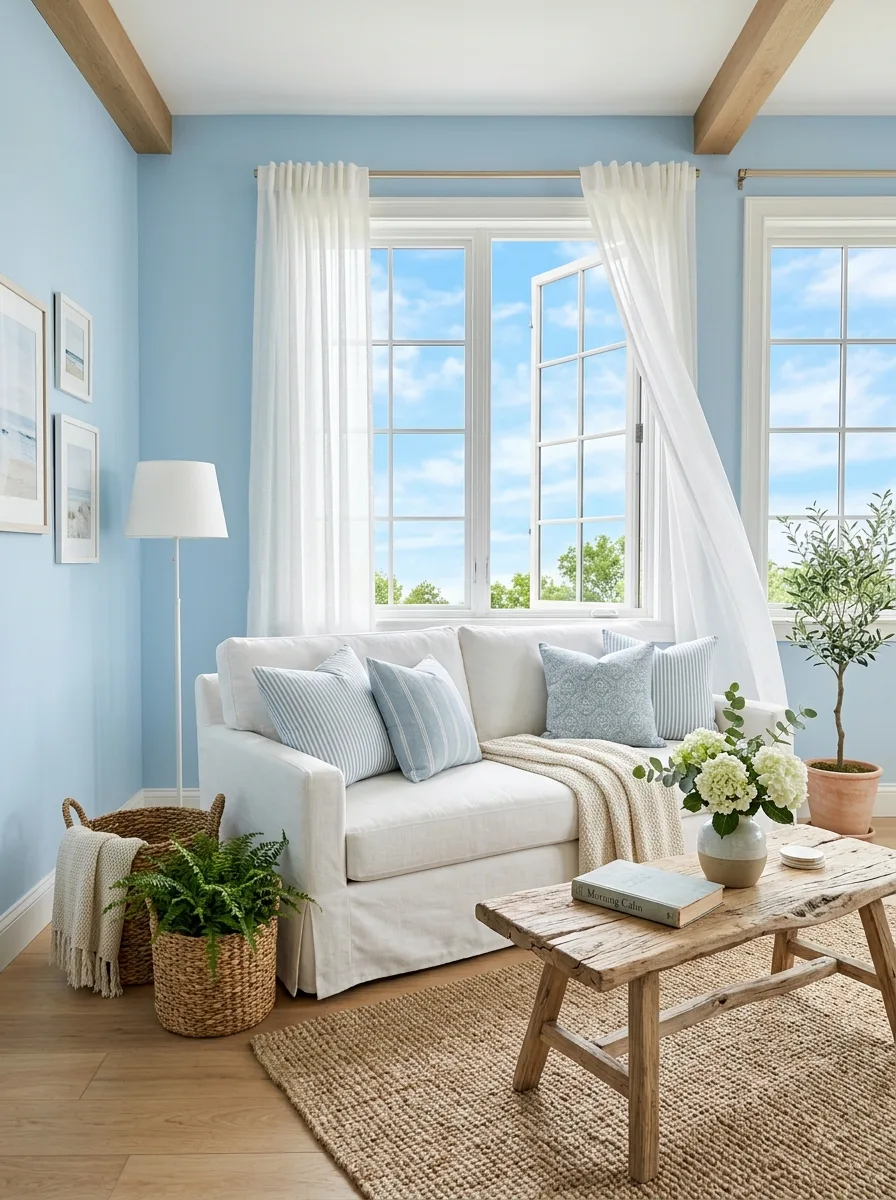
Sky blue is one of the most universally calming colors in the entire spectrum. It evokes open skies, clear water, and the feeling of a perfect spring morning. In color psychology, light blue reduces blood pressure, slows heart rate, and promotes clear, calm thinking. A sky blue living room is a place where stress naturally melts away and conversations flow easily and gently.
This color works beautifully in living rooms with large windows where natural light can bring out the airiness of the blue and make the room feel expansive and fresh. Pairing sky blue with white woodwork, natural fiber rugs, and light wood furniture creates a coastal, breezy aesthetic that is both relaxing and effortlessly stylish. It is hard to feel anxious in a sky blue room.
14. Burnt Orange for Creative Stimulation
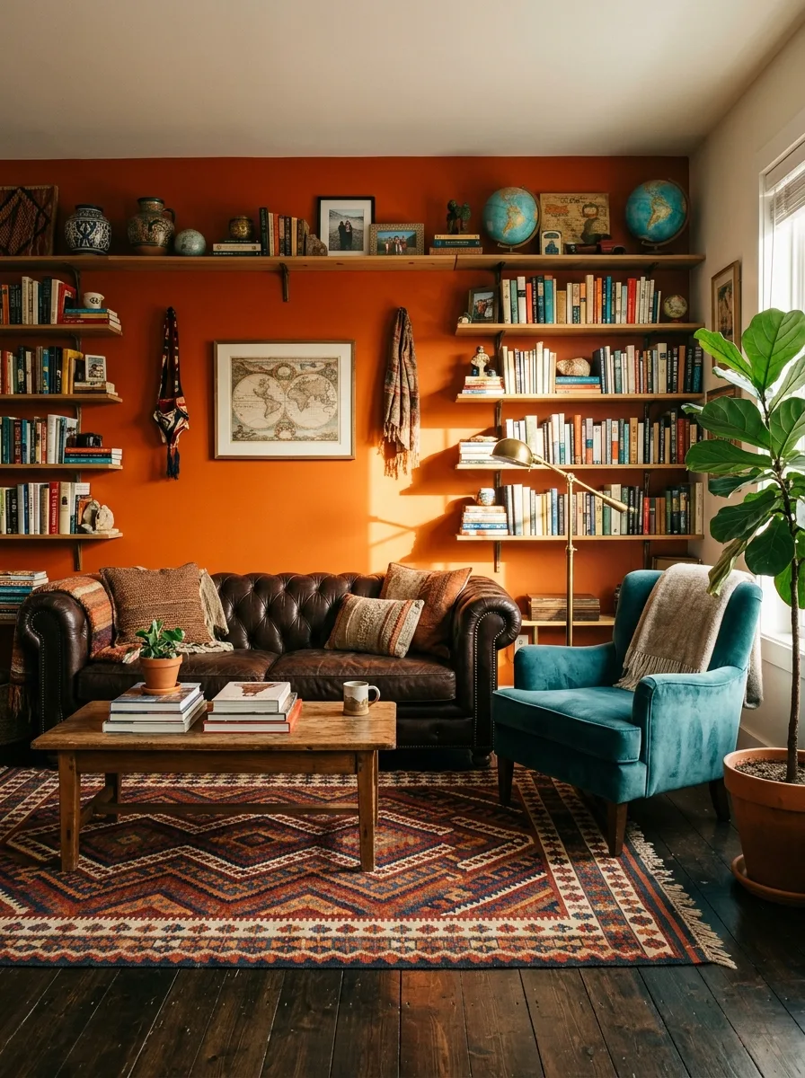
Burnt orange is a deep, warm shade that stimulates creativity, enthusiasm, and a sense of adventure. It is bolder than terracotta and more grounded than bright orange, sitting perfectly in the space where energy meets sophistication. A burnt orange accent wall or a pair of burnt orange armchairs brings a living room to life with a sense of creative confidence and artistic flair.
The psychology of orange is strongly connected to social energy and warmth. It is a color that encourages interaction and makes people feel welcome and engaged. Pairing burnt orange with dark chocolate brown, deep teal, and cream creates a palette that feels rich, worldly, and inspired by global design traditions. This is a color for living rooms that tell a story.
15. Dusty Rose for Understated Romance
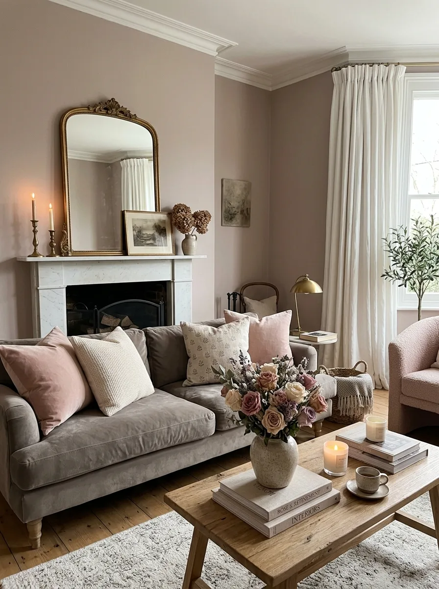
Dusty rose is a muted, mature pink that carries a quiet sense of romance and emotional warmth without feeling overly sweet or juvenile. It is a color that communicates tenderness, empathy, and a refined sensibility. In a living room, dusty rose creates an atmosphere that feels both intimate and polished, making guests feel genuinely cared for and comfortable.
This color pairs exceptionally well with warm gray, sage green, and antique gold to create a palette that is both modern and timeless. A dusty rose sofa against warm white walls, or dusty rose curtains framing a window, adds just enough color to feel intentional without dominating the room. It is a color of quiet confidence and understated beauty.
16. Teal for Balanced Vibrancy
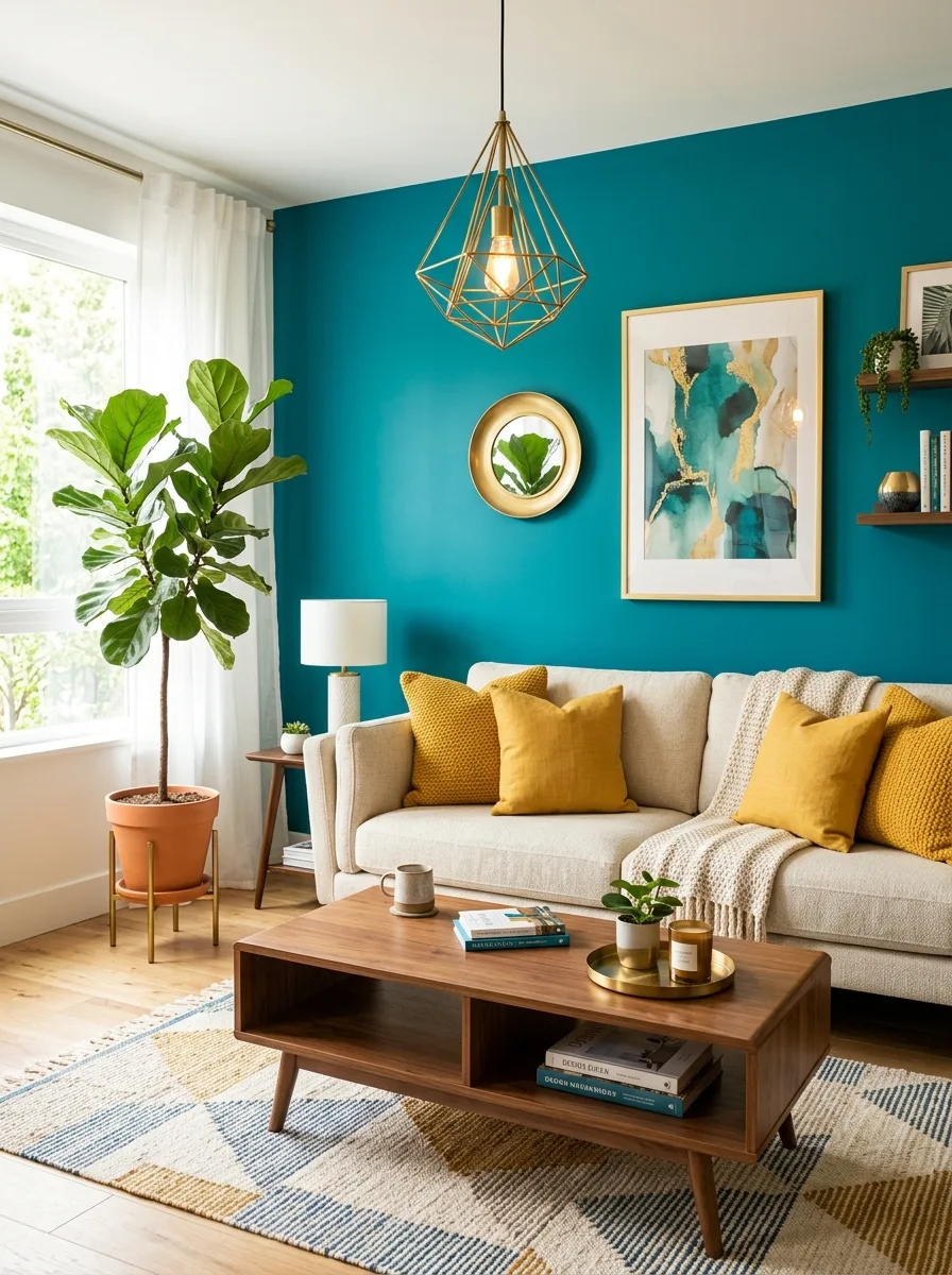
Teal is a blue green hybrid that offers the calming properties of blue with the revitalizing energy of green, creating a uniquely balanced and vibrant color for living rooms. It is rich enough to make a bold statement yet cool enough to remain calming and easy on the eyes. Teal communicates creativity, emotional balance, and a sense of refreshed clarity that few other colors achieve.
A teal accent wall behind a neutral sofa creates a stunning focal point that anchors the room with color and confidence. Pairing teal with mustard yellow creates one of the most dynamic and visually exciting complementary palettes in interior design. Adding warm wood tones and cream textiles keeps the room feeling approachable and comfortable while the teal provides the visual excitement.
17. Warm Taupe for Quiet Elegance
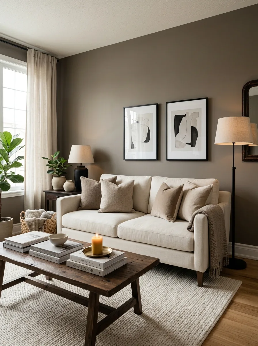
Warm taupe is a rich, complex neutral that sits between gray and brown, offering the sophistication of gray with the warmth of brown in a single understated hue. It is a color that feels inherently elegant and refined without making any loud statement. Psychologically, taupe promotes feelings of composure and stability, making it ideal for living rooms designed for relaxation and quiet conversation.
The versatility of taupe is what makes it such a valuable choice for living rooms. It works as a wall color, a furniture upholstery, or a rug tone with equal effectiveness. Layering different shades of taupe with soft white accents and touches of black creates a monochromatic palette that is quietly luxurious and endlessly sophisticated without ever feeling cold or sterile.
18. Rich Burgundy for Intimate Luxury
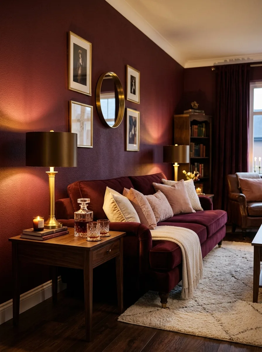
Rich burgundy is a deep, wine inspired red that creates an atmosphere of intimate luxury and emotional depth in a living room. It is a color associated with richness, passion, and a sense of occasion. Unlike bright reds that can feel aggressive and overstimulating, burgundy has a muted sophistication that invites you to settle in and enjoy the warmth and beauty of the space around you.
A burgundy velvet sofa or a single burgundy painted wall transforms a living room into something that feels genuinely special and memorable. Pairing burgundy with dark wood, warm brass, and soft cream or blush pink accents creates a palette inspired by old world elegance and fine wine cellars. This is a color for living rooms that are meant to feel like an experience.
19. Pale Aqua for Refreshing Serenity
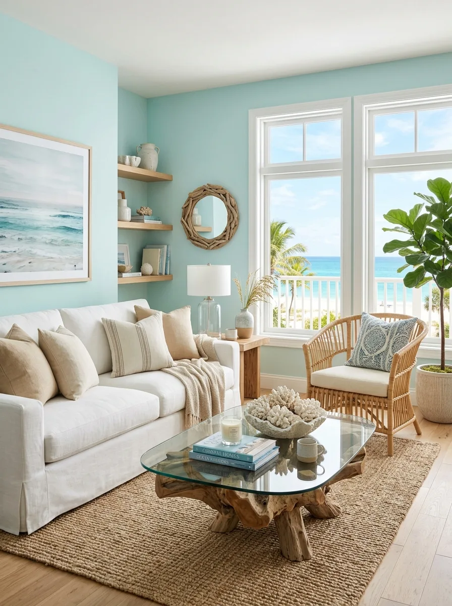
Pale aqua is a light, refreshing blue green that evokes tropical waters, sea glass, and the feeling of a coastal morning breeze. It is a color that immediately lifts the mood and creates a sense of lightness and renewal. Psychologically, aqua tones promote emotional clarity and a feeling of being refreshed, making a living room painted in this color feel like a rejuvenating escape.
This color is particularly effective in smaller living rooms where its light, reflective quality can make the space feel larger and more open. Pairing pale aqua with sandy beige, crisp white, and natural driftwood textures creates a coastal palette that feels relaxed and vacation inspired. It is a color that brings a touch of paradise into everyday living.
20. Olive Green for Earthy Sophistication
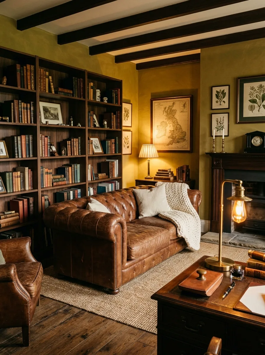
Olive green is a warm, muted green with golden undertones that brings an earthy sophistication to any living room. It is a color deeply connected to nature, growth, and organic beauty, and it carries a sense of timeless refinement that brighter greens cannot achieve. Olive green living rooms feel grounded, mature, and quietly stylish in a way that never goes in or out of fashion.
Pairing olive green walls with rich brown leather, dark walnut wood, and warm amber lighting creates a palette that feels like a well appointed study or a beautiful country house sitting room. Adding textured elements like a chunky wool throw or a woven jute rug deepens the earthy quality and makes the space feel layered and thoughtfully composed from every angle.
21. Warm Copper Accents for Inviting Glow
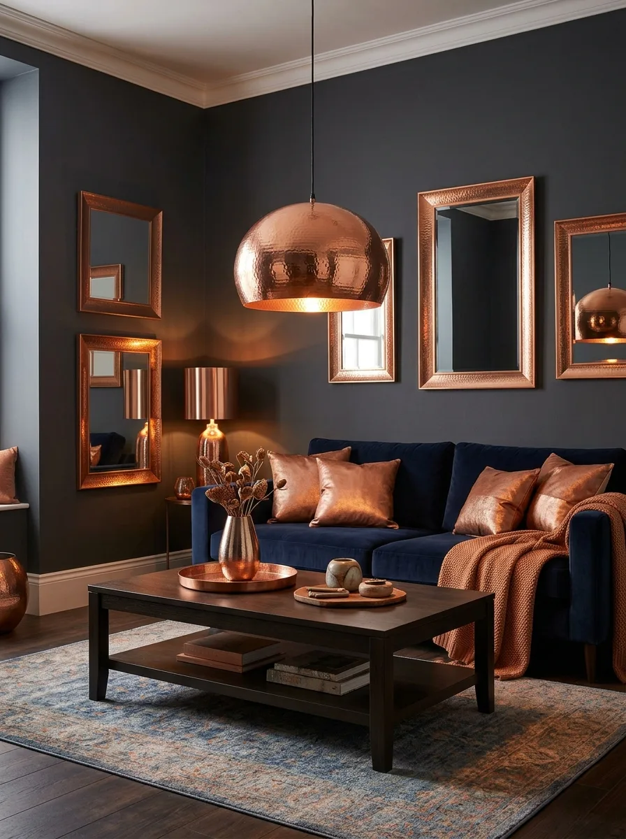
Incorporating warm copper tones into a living room through metallic accents, textiles, and decorative objects creates a subtle, inviting glow that elevates the entire space. Copper is a color associated with warmth, connection, and abundance. It catches and reflects light beautifully, adding a luminous quality that makes the room feel alive and gently radiant at every time of day.
Copper works as an accent color rather than a wall color, and that restraint is part of what makes it so effective. A copper pendant light, a set of copper framed mirrors, or copper toned throw pillows scattered on a dark sofa bring warmth and sophistication without overwhelming the palette. Pairing copper with deep navy, charcoal gray, or forest green creates a rich and refined combination.


