

24 Luxury Living Room Color Palette Ideas
A luxury living room depends less on price than on a controlled palette: a few colors repeated across walls, upholstery, wood and metal, with plenty of texture. Restraint and good materials do more than any single expensive piece.
Below are 24 palettes, each with how to use the colors and one practical tip on materials, care or light. Start with the basics, because the same paint can look rich or flat depending on light, sheen and proportion.
Basics for a rich-looking palette
Use the 60-30-10 guideline
A common designer rule of thumb puts about 60 percent of the room in the main color (walls, a large rug), 30 percent in a secondary color (upholstery, curtains) and 10 percent in an accent (metal, cushions, art). For the moods different colors are commonly linked with, see these living room color psychology ideas.
Check the light
Sherwin-Williams notes that north-facing rooms get the least light, so cool undertones look colder there, while south-facing rooms get warm light. The light reflectance value (LRV) on a paint chip, from 0 to 100, shows how much light a color reflects; deep luxury colors have low numbers and need good lighting.
Choose the sheen on purpose
Flat and matte finishes reflect little light and give walls a soft, velvety look. Glossier finishes reflect more, but they also show bumps and uneven patches, so they suit trim, doors and smooth surfaces.
Pick materials you can live with
Marble is etched by acids, and the Natural Stone Institute notes that sealing makes stone more stain resistant, not stain proof, so use coasters and mild, non-acidic cleaners. Velvet and leather fade in strong sun, and unlacquered brass and copper darken over time.
The 24 palettes at a glance
| Palette | Mood | Main color on | Watch for |
|---|---|---|---|
| Ivory, gold, soft taupe | Quiet, warm | Walls | Too many gold finishes |
| Navy, brass, cream | Classic, rich | Walls | Lighting in dim rooms |
| Charcoal, blush, marble white | Modern, soft contrast | Accent wall | Marble etching |
| Forest green, camel, antique gold | Traditional, enveloping | Walls, shelving | Low light, leather fading |
| All white with texture | Calm, airy | Walls and sofa | Stains on upholstery |
| Black, white, chrome | Graphic, modern | Walls or furniture | Fingerprints, clutter |
| Warm gray, champagne, walnut | Calm, versatile | Walls | Gray undertones |
| Burgundy, dark wood, cream | Warm, formal | Sofa or one wall | Velvet fading |
| Blue-gray, silver, white linen | Cool, serene | Walls | Coldness in north light |
| Emerald, black, gold | Art Deco, glamorous | Sofa or walls | Busy room |
| Sand, stone, driftwood | Natural, relaxed | Walls and sofa | Flatness without texture |
| Plum, dusty rose, warm gray | Romantic, rich | Accent chair | Fading of deep colors |
| Teal, copper, charcoal | Modern, warm and cool | Sofa and cushions | Copper patina |
| Mocha, cream, bronze | Cozy, warm | Sofa or one wall | Dark room |
| Pale mint, white, oak | Fresh, light | Walls | Coldness in north light |
| Midnight blue, purple, silver | Dramatic | Walls | Light levels |
| Terracotta, olive, cream | Earthy, Mediterranean | Accent wall | Dull in dim rooms |
| Peach, warm white, rattan | Relaxed, warm | Walls | Rattan in direct sun |
| Steel blue, slate, aged brass | Industrial, refined | Walls | Coolness |
| Lilac, sage, warm wood | Soft, garden-like | Walls | Too sweet |
| Honey gold, brown, ivory | Warm, golden | Curtains, leather | Cool bulbs |
| Dusty blue, linen, matte black | Calm, modern | Walls | Linen care |
| Coral, navy, warm white | Bold, lively | Accent wall | Balance of brights |
| Pure neutrals with texture | Quiet, tactile | Everything | Too little texture |
1. Ivory, Gold, and Soft Taupe
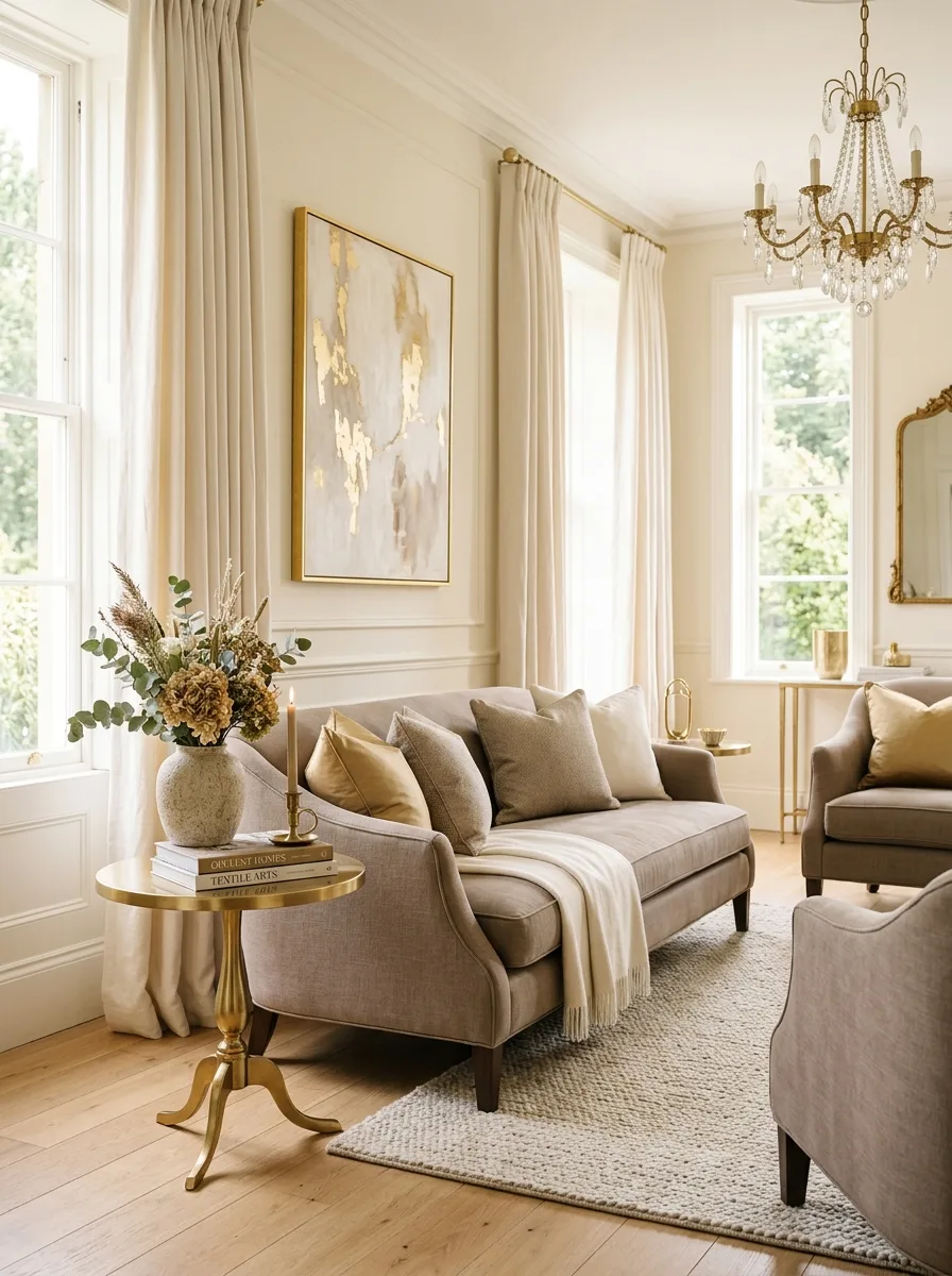
Ivory walls give a warm, light base, gold adds shine in lighting, frames and hardware, and soft taupe on the sofa and curtains grounds the scheme. Every tone is warm, so the room feels calm and cohesive. Keep the gold to a few deliberate pieces so it reads as a highlight, not decoration on every surface.
Good to know: mixing many gold finishes looks accidental. Pick one tone, such as brushed or antique gold, and repeat it in two or three places around the room.
2. Navy Blue, Brass, and Cream
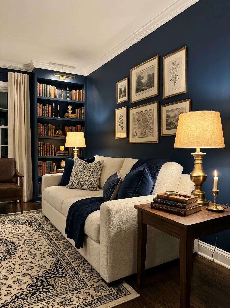
Navy walls with brass lamps and cream upholstery is a classic combination: the navy gives depth, the brass warms it and the cream keeps the room from feeling heavy. It draws on traditional libraries and studies, but looks modern with clean-lined furniture and little clutter.
Good to know: unlacquered brass darkens and develops a patina over time, while lacquered brass stays bright. Decide which look you want before buying lamps and hardware, so the pieces age the same way.
3. Charcoal, Blush Pink, and Marble White
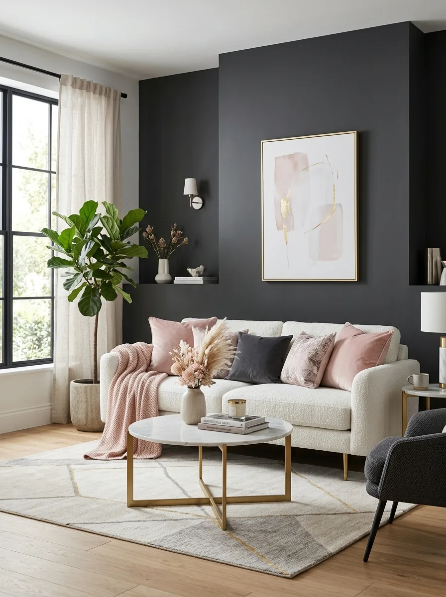
Deep charcoal, soft blush and marble white make a palette of contrasts: the charcoal grounds the room, the blush softens it and the white stone adds a clean, polished note. Try a charcoal accent wall, blush velvet cushions on a white or gray sofa and a marble-topped coffee table.
Good to know: marble is etched by acids such as wine, citrus juice and many household cleaners. Use coasters and a mild, non-acidic stone cleaner, and reseal as the stone supplier recommends.
4. Forest Green, Camel, and Antique Gold
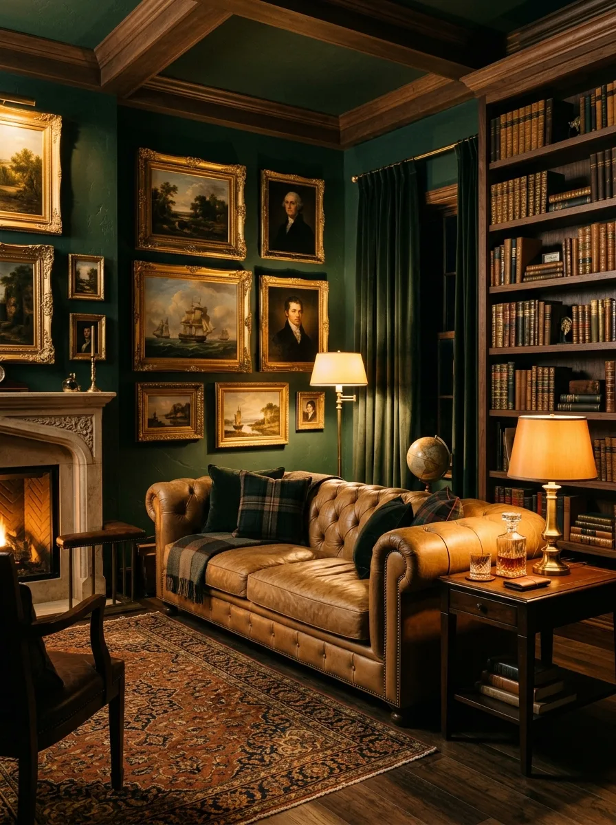
Forest green walls, camel leather and antique gold accents create a rich, traditional room with the feel of a private study. The palette works best with dark wood: walnut bookshelves against green walls, a camel leather sofa and gold-framed art. It looks strongest when the green goes on every wall.
Good to know: leather fades and dries out in direct sun, so keep a camel leather sofa out of strong sunlight and condition it as the maker recommends.
5. All White with Warm Texture
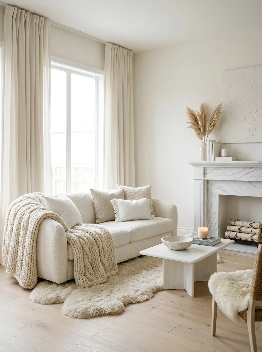
An all-white room looks rich rather than stark when it layers several whites with textured materials: bouclé, chunky knits, sheepskin, linen and wool. The variation in texture gives the eye something to read. A white bouclé sofa on a cream wool rug beside an ivory stone fireplace shows the idea; for more, see these white living room ideas.
Good to know: white upholstery shows marks, so choose washable slipcovers or a performance fabric. Keep samples of each white together when shopping so the undertones match.
6. Black, White, and Polished Chrome
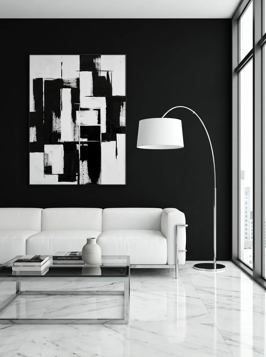
Black and white with polished chrome is graphic and modern. Black walls or furniture add weight, white surfaces give contrast, and chrome on lighting, table legs and objects adds a crisp, reflective line. The high contrast makes every object stand out, so the palette needs clean lines and very little clutter.
Good to know: polished chrome and glossy black show fingerprints and dust, so use them on pieces that aren’t handled all the time, and choose matte black for walls.
7. Warm Gray, Champagne, and Walnut
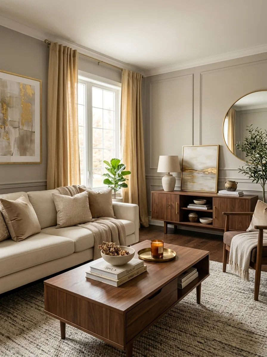
Warm gray walls, champagne metal and walnut wood make a quiet, versatile palette. The gray is the neutral base, champagne gives a softer shine than gold, and walnut adds warmth and depth. Cream upholstery and champagne-colored curtains complete the room.
Good to know: gray paint can lean blue, green or purple, and a cool gray can clash with warm walnut. Compare samples against the wood and fabrics you plan to use.
8. Burgundy, Dark Wood, and Cream
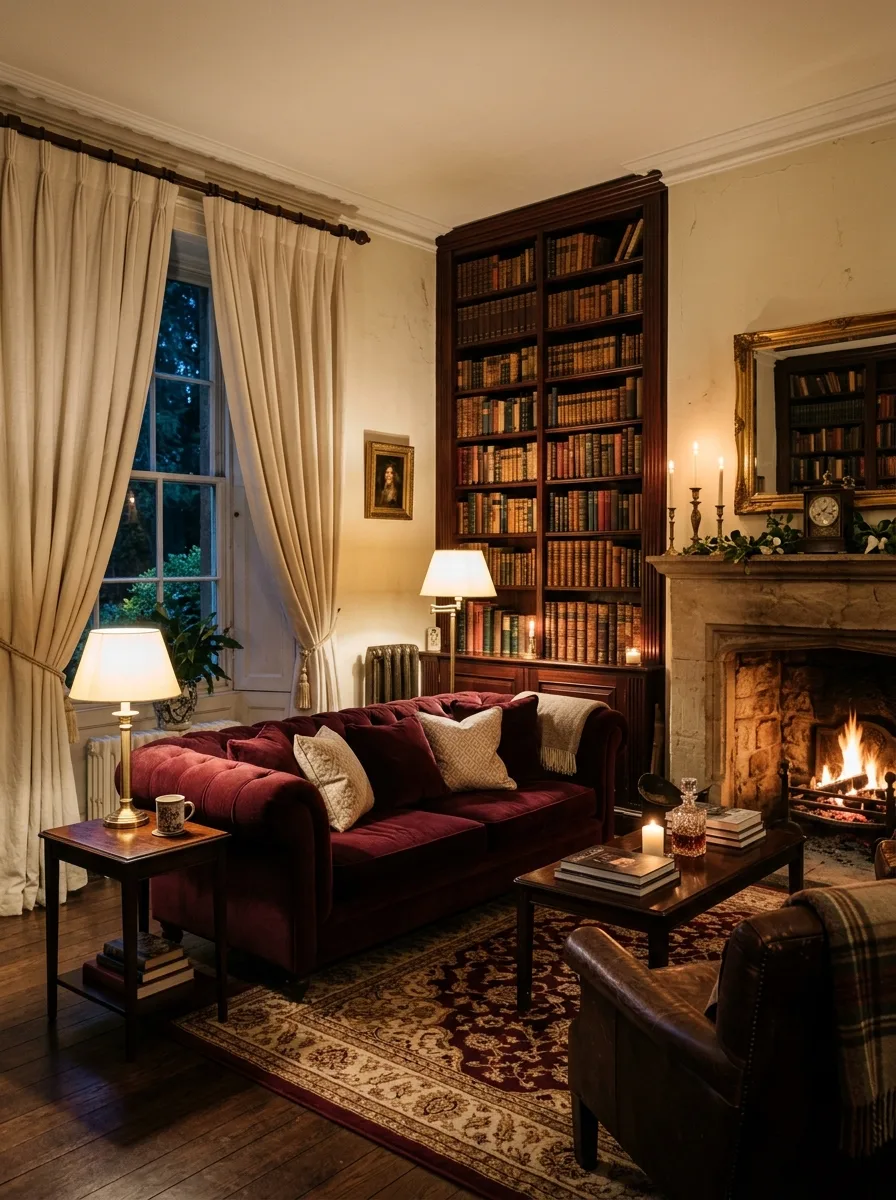
Burgundy brings the depth of red wine and velvet into a living room, while dark wood adds weight and cream keeps the scheme from closing in. A burgundy velvet sofa or one burgundy wall is enough to set the tone. Mahogany or walnut shelves and cream linen curtains suit it well.
Good to know: deep-colored velvet fades in direct sun and shows pressure marks, so place it away from bright windows and brush the pile gently to keep it even.
9. Soft Blue Gray, Silver, and White Linen
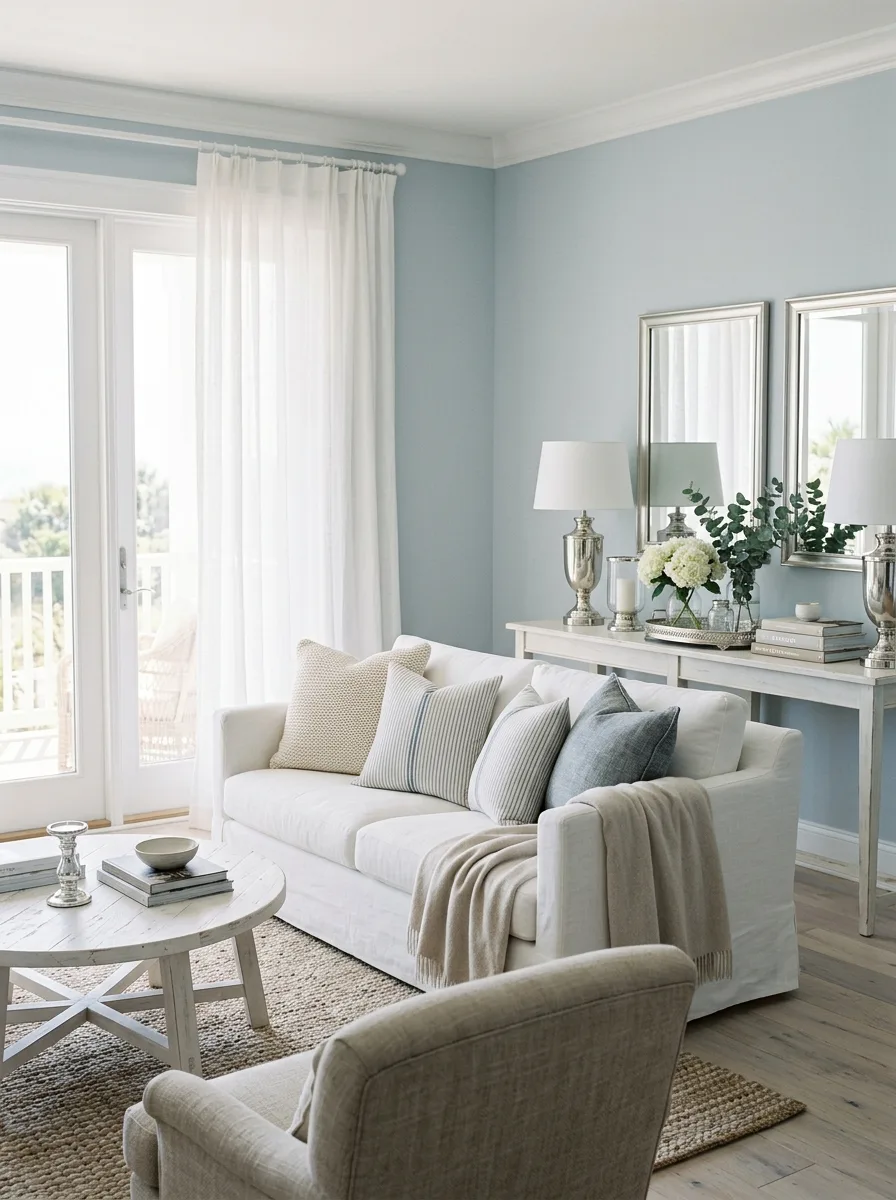
Soft blue-gray walls, silver accents and white linen upholstery make a cool, calm living room inspired by coastal interiors. The blue-gray is restful, silver adds a quiet shine, and white linen keeps the room light. Silver-framed mirrors and glass accessories carry the look through.
Good to know: cool blue-grays can look cold in a north-facing room, so add warm-white bulbs and some natural wood or textured wool to balance them.
10. Emerald Green, Black, and Gold
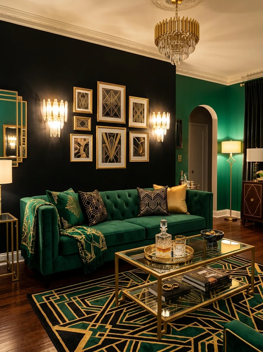
Emerald, black and gold is an Art Deco-inspired palette with strong contrast. The emerald gives a jewel-toned focal point, black adds definition and gold ties the two together. An emerald velvet sofa against a black wall, with gold-framed art and a gold-legged coffee table, shows the look at full strength.
Good to know: with three strong elements, keep the rest of the room calm: plain floors, simple curtains and only a few gold pieces stop it from looking busy.
11. Sand, Stone, and Driftwood
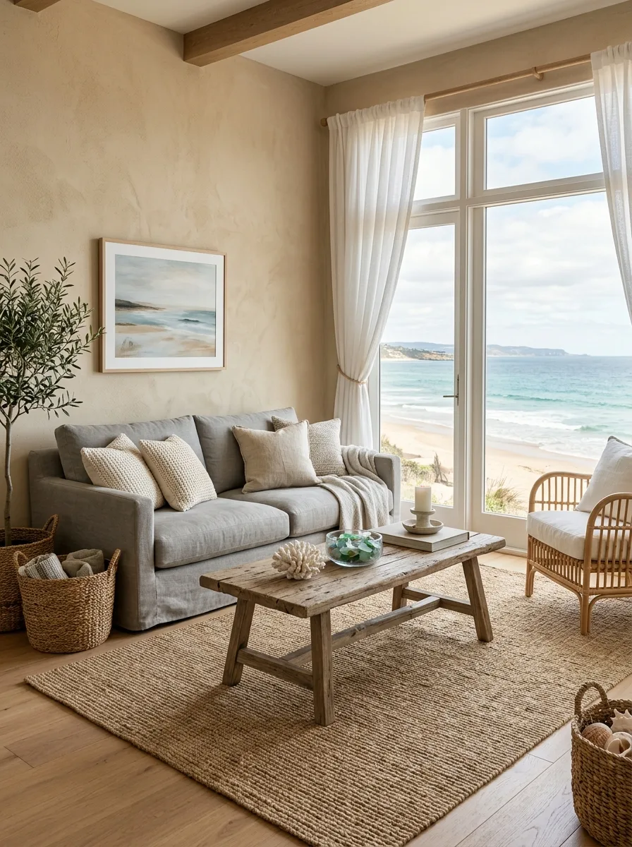
Sandy beige, warm stone gray and weathered wood tones come straight from nature, so the room feels calm and settled. The palette works best when the materials match the colors: a stone-topped coffee table, a sand-colored linen sofa and a weathered wood lamp base. Soft white throws and woven baskets complete it.
Good to know: an all-neutral room needs texture to avoid looking flat, so mix rough and smooth materials, such as linen with stone or wool with weathered wood.
12. Plum, Dusty Rose, and Warm Gray
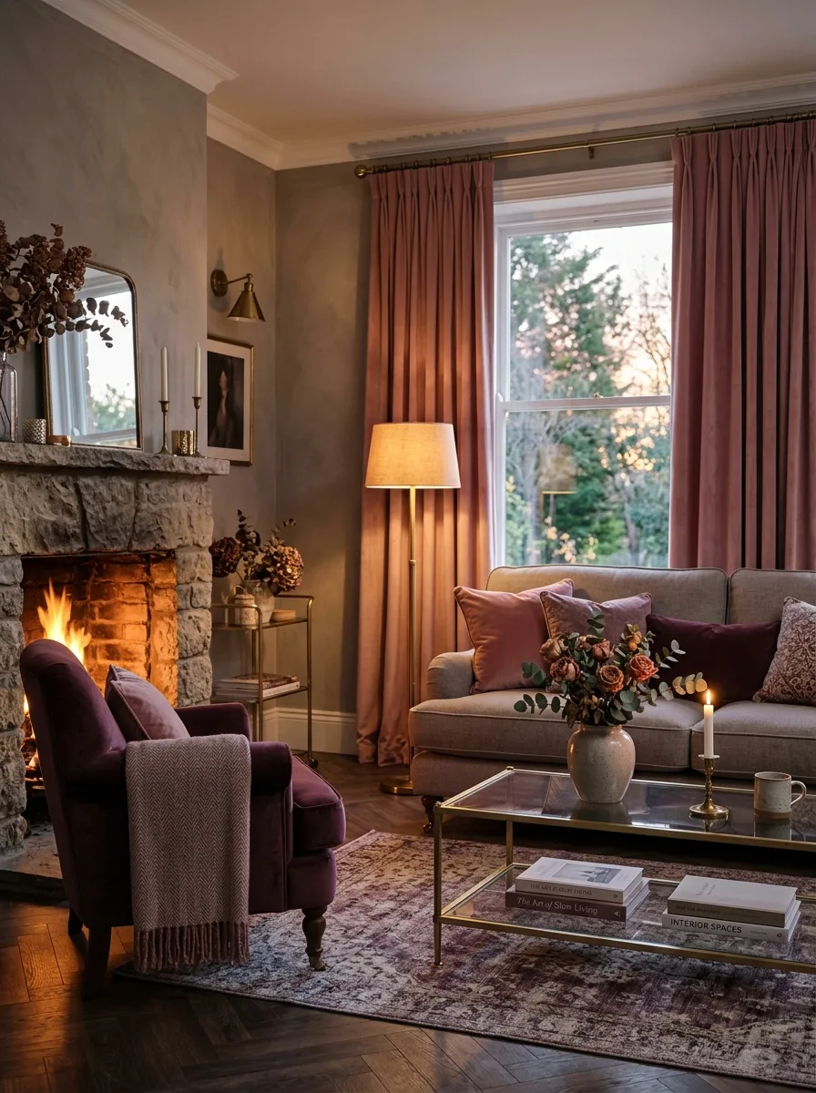
Plum is an underused deep color that adds depth and warmth. With dusty rose and warm gray, the plum anchors the scheme, the rose softens it and the gray bridges the two. A plum velvet armchair in a warm gray room, with dusty rose cushions and curtains, looks especially warm under evening lamplight.
Good to know: deep fabric colors fade in sun, so put plum upholstery where it gets less direct light, such as a corner or a wall away from the window.
13. Teal, Copper, and Charcoal
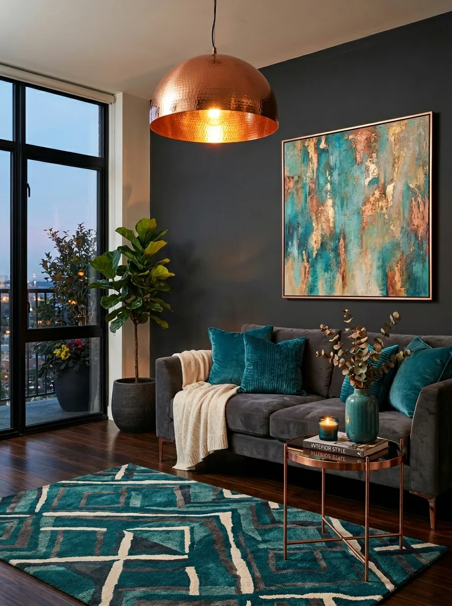
Teal, copper and charcoal mix cool and warm: the teal brings color and depth, copper adds a warm metallic glow, and charcoal gives a strong, neutral base. A charcoal sofa with teal velvet cushions under a copper pendant is a simple way to use all three.
Good to know: uncoated copper darkens and develops a patina over time, so choose lacquered copper if you want it to stay bright.
14. Mocha, Cream, and Bronze
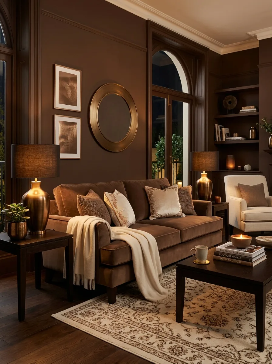
Mocha, cream and bronze wrap a room in warm, cocoa-brown tones. Mocha walls or a mocha velvet sofa set the mood, cream adds light, and bronze lamps and hardware add a subtle metallic note. Cream throws and dark chocolate wood accents finish the look.
Good to know: brown walls absorb a lot of light, so in a dim room put the mocha on the sofa or one wall and keep the other walls cream.
15. Pale Mint, White, and Natural Oak
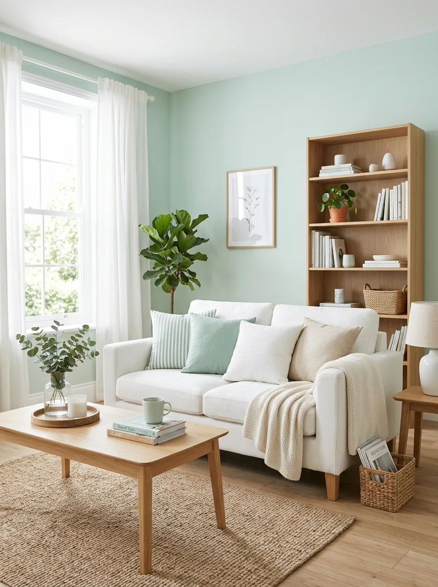
Pale mint, white and light oak make a fresh, Scandinavian-style palette. The mint adds a touch of color, the white keeps the room bright, and oak adds warmth and texture so the room doesn’t feel clinical. It looks best in rooms with large windows and plenty of daylight.
Good to know: pale greens can look cold or gray in north light, so choose a mint with a slightly warm or creamy undertone if the room faces north.
16. Midnight Blue, Velvet Purple, and Silver
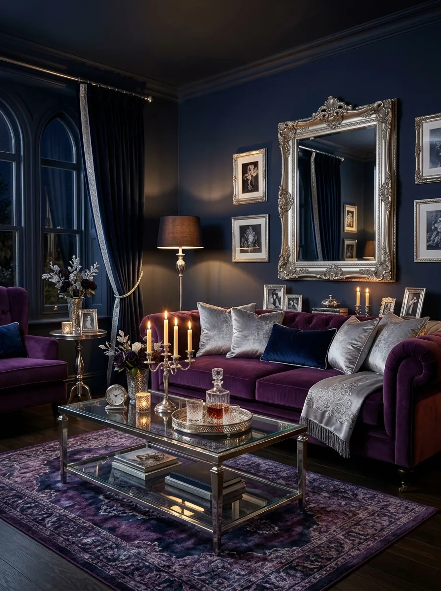
Midnight blue walls, purple velvet upholstery and silver accents make a dramatic, enveloping palette. The blue and purple build depth, and silver mirrors, frames and lighting add sparkle so the room doesn’t feel heavy. It suits a living room used mostly in the evening.
Good to know: two dark colors together need plenty of light, so plan table lamps, wall lights and dimmers, and use a mirror to bounce light around the room.
17. Warm Terracotta, Olive, and Cream
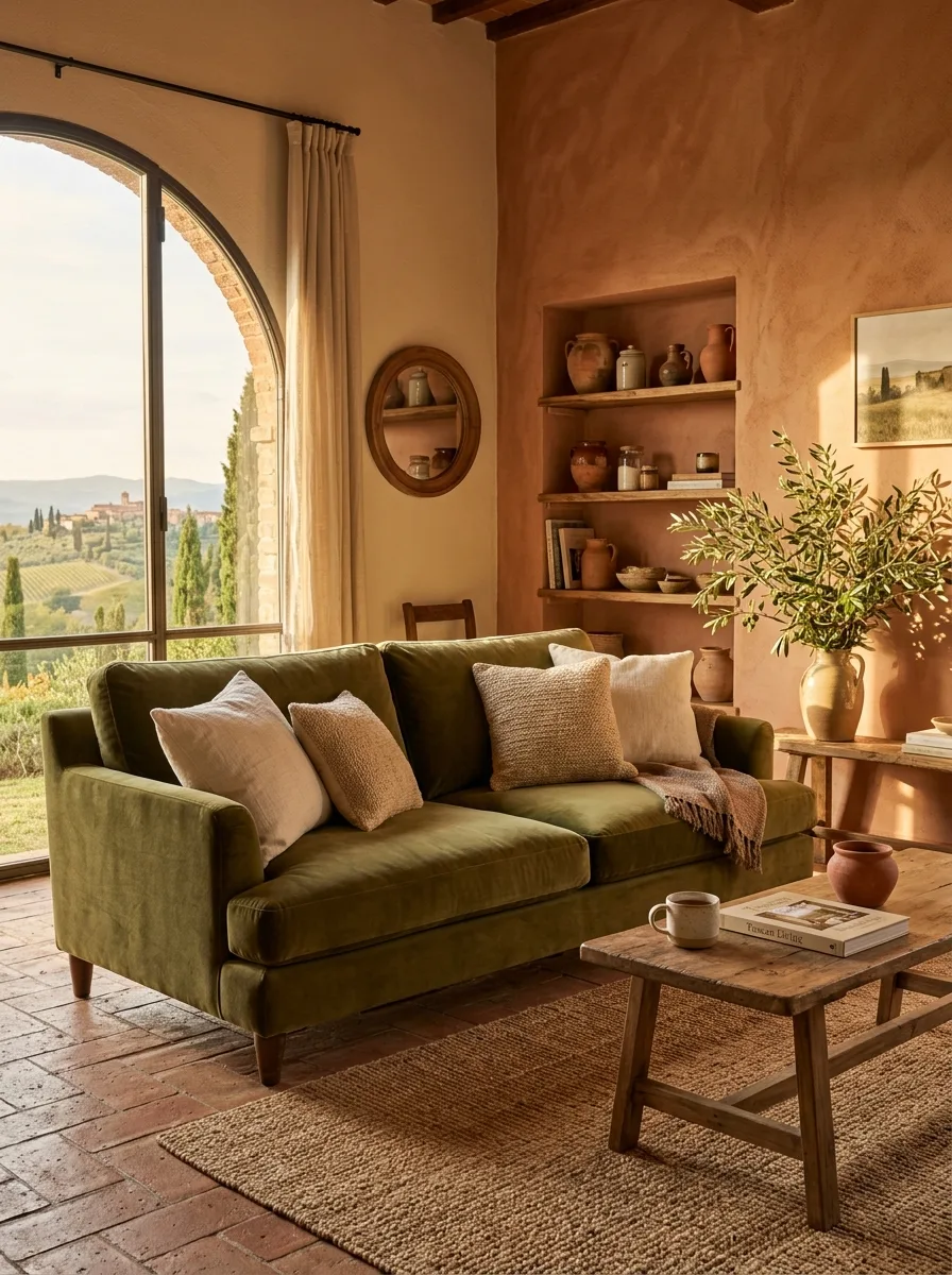
Terracotta, olive green and cream create a warm, earthy, Mediterranean palette. A terracotta accent wall behind an olive velvet sofa with cream linen cushions shows the combination at its simplest. Terracotta pots, olive branches in a ceramic vase and warm wood accessories add to the mood.
Good to know: terracotta glows in a sunny room but can look dull in a dim one, so test a large sample on the wall you plan to paint.
18. Soft Peach, Warm White, and Rattan
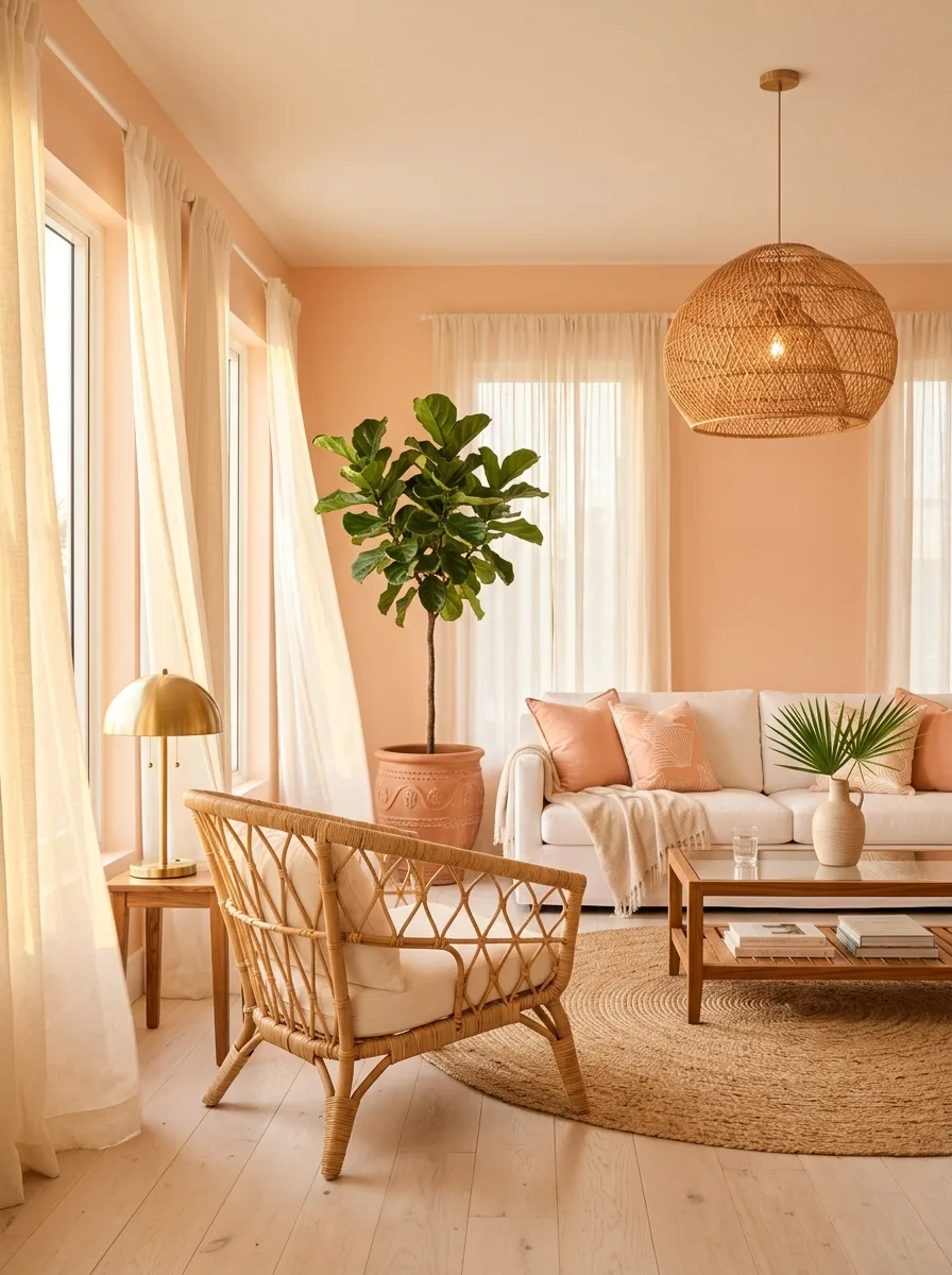
Soft peach, warm white and natural rattan make a relaxed, warm palette with a resort feel. The peach adds a gentle glow, the white keeps the room airy, and rattan brings texture. A rattan accent chair, white linen curtains and some greenery complete it, and brass light fixtures add polish.
Good to know: natural rattan can dry out, fade and turn brittle in strong sun or next to a heater, so place it away from both and dust it with a soft brush.
19. Steel Blue, Slate, and Aged Brass
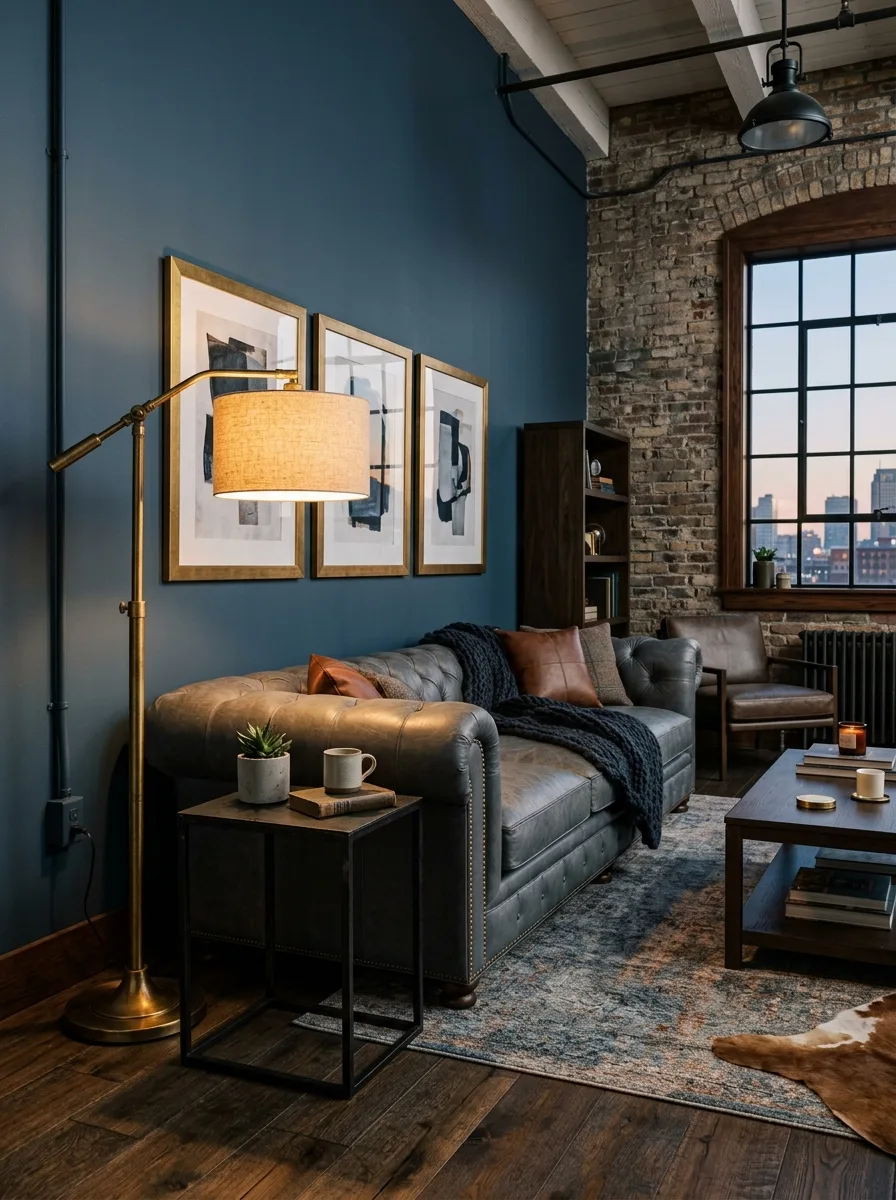
Steel blue walls, slate gray furniture and aged brass accents make a cool, industrial palette with warmth from the metal. It suits rooms with exposed brick, concrete or metal-framed windows. A slate gray sofa, aged brass table lamps and dark leather accessories fit the look.
Good to know: the palette leans cool, so add warmth with brass, leather, wood and warm-white bulbs, especially in a north-facing room.
20. Lilac, Sage, and Warm Wood
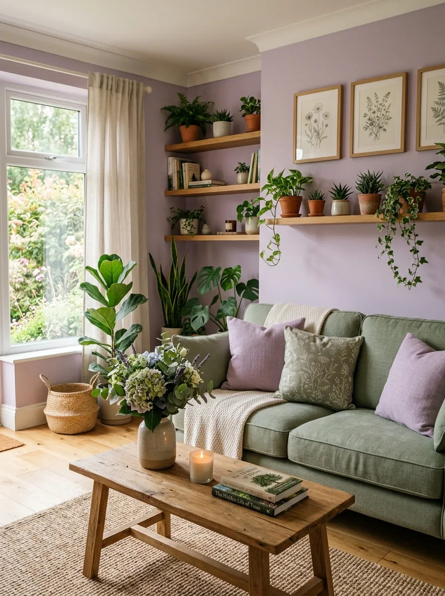
Lilac and sage green make a soft, garden-like pairing, and warm wood keeps the pale colors grounded. Lilac walls with sage upholstery and oak shelves feel calm and fresh. Fresh flowers and botanical prints add to the garden mood.
Good to know: two pastels together can look sweet, so choose versions with some gray in them and add a darker element, such as a wood floor or a deep green plant, for contrast.
21. Honey Gold, Rich Brown, and Ivory
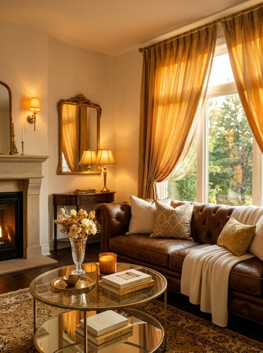
Honey gold, rich brown and ivory give a living room a warm, golden glow. The honey gold adds richness, the deep brown grounds the room and ivory walls keep it light. Honey gold curtains, a brown leather sofa and gold hardware show the palette at its simplest.
Good to know: warm-white bulbs suit this palette; cool daylight bulbs can make warm golds and browns look flat.
22. Dusty Blue, Warm Linen, and Matte Black
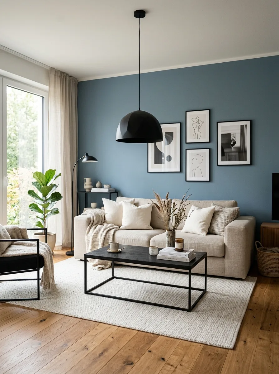
Dusty blue is a muted, gray-leaning blue that looks calm and modern. Natural linen adds warmth and texture, and matte black on light fixtures and frames adds crisp definition. The mix of warm and cool suits city apartments and country houses alike.
Good to know: linen wrinkles and can shrink if washed hot, so check whether linen slipcovers are prewashed or dry-clean only before you buy.
23. Coral, Navy, and Warm White
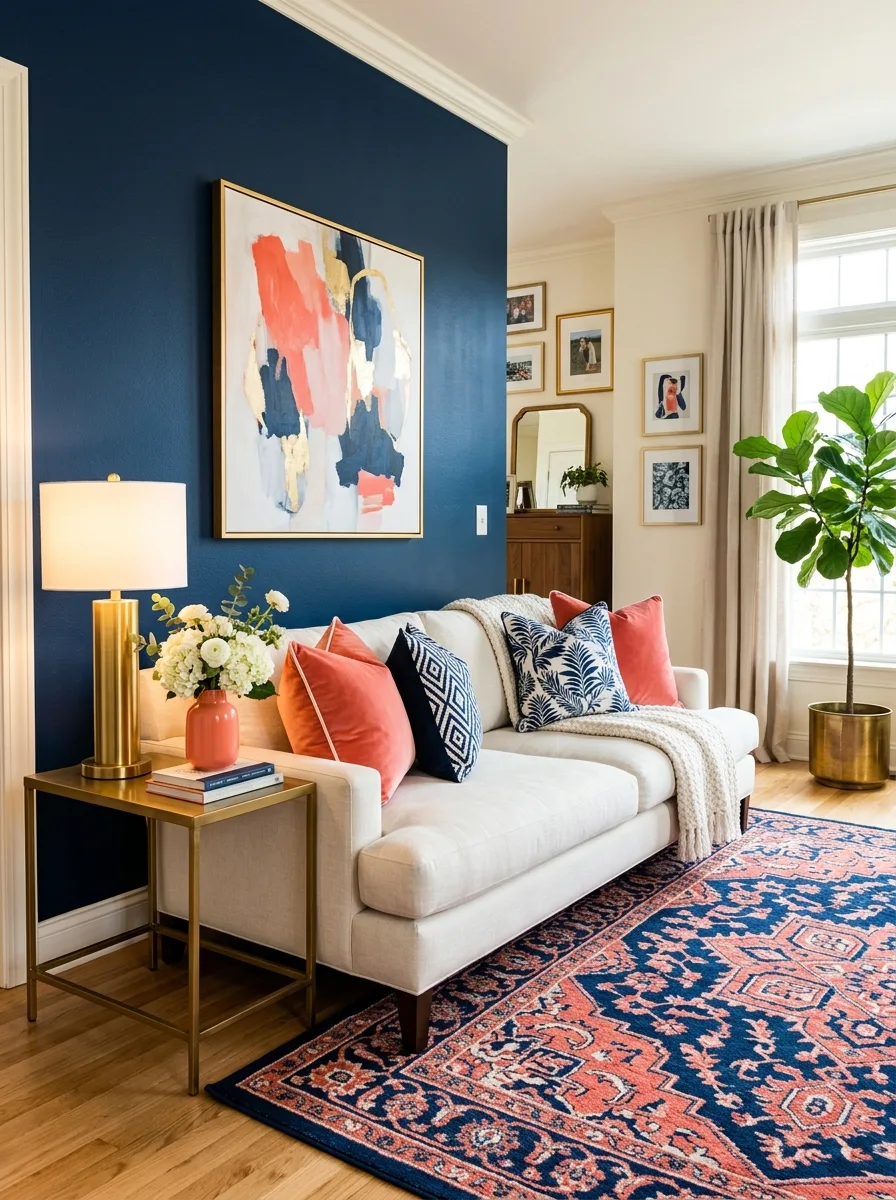
Coral and navy make a bold, lively pairing: the coral brings warmth and energy, the navy gives depth and contrast, and warm white lets both colors show. A navy accent wall, coral velvet cushions on a warm white sofa, brass accessories and a navy patterned rug show how they work together.
Good to know: apply the 60-30-10 idea: let warm white or navy cover most of the room and keep coral as the smallest share, so the bright color stays an accent.
24. Pure Neutrals with Textural Contrast
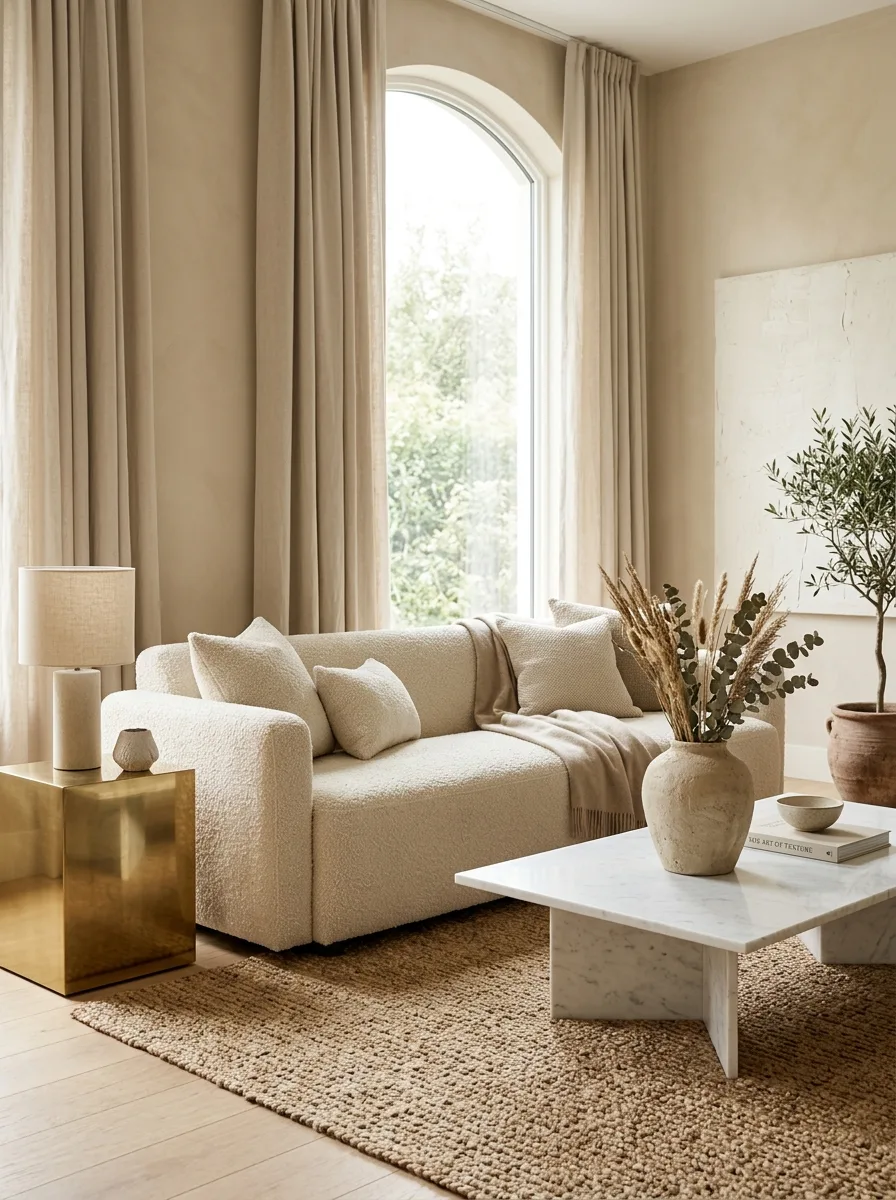
A palette of white, cream, beige, oatmeal and warm gray relies on texture instead of color. With no strong color, the eye notices the materials: smooth marble beside rough linen, polished wood beside matte ceramic, velvet beside woven rattan. Mixing many textures within the neutral range keeps the room from looking flat.
Good to know: repeat each texture at least twice around the room, such as linen on the sofa and the curtains, so the mix looks planned rather than random.
Common mistakes to avoid
- Using too many accent colors or metal finishes in one room.
- Choosing paint from a small chip without checking it in the room’s light.
- Painting a dim room a dark color without planning extra lighting.
- Using glossy paint on uneven walls, where it shows every flaw.
- Putting acid-sensitive marble, or sun-sensitive velvet and leather, where they will be damaged.
Luxury living room color FAQs
What colors make a living room look expensive?
Deep, muted colors such as navy, forest green and charcoal, or layered warm neutrals, look most refined when paired with natural materials and one main metal finish.
How many colors should a living room palette have?
Usually three: a main color, a secondary color and an accent, roughly in a 60-30-10 split.
Should metals match in a luxury living room?
They don’t have to, but one main finish repeated in a few places looks more deliberate than many mixed finishes.


One Comment