

24 Red Brick House Exterior Color Scheme Ideas
Choosing the right exterior color scheme for a red brick house can feel overwhelming because the warm tones of the brick already establish a strong visual presence that every other color must work around. The beauty of red brick is that it actually pairs well with a surprisingly wide range of palettes from classic neutrals to bold modern combinations that most homeowners never consider. The key is understanding which trim, door, shutter, and accent colors enhance the natural warmth of your brick rather than fighting against it or making the whole facade feel muddy and confused. These 24 red brick house exterior color scheme ideas will give you proven combinations that professional designers rely on to make red brick homes look their absolute best regardless of architectural style or neighborhood setting.
1. Classic White Trim with Black Shutters
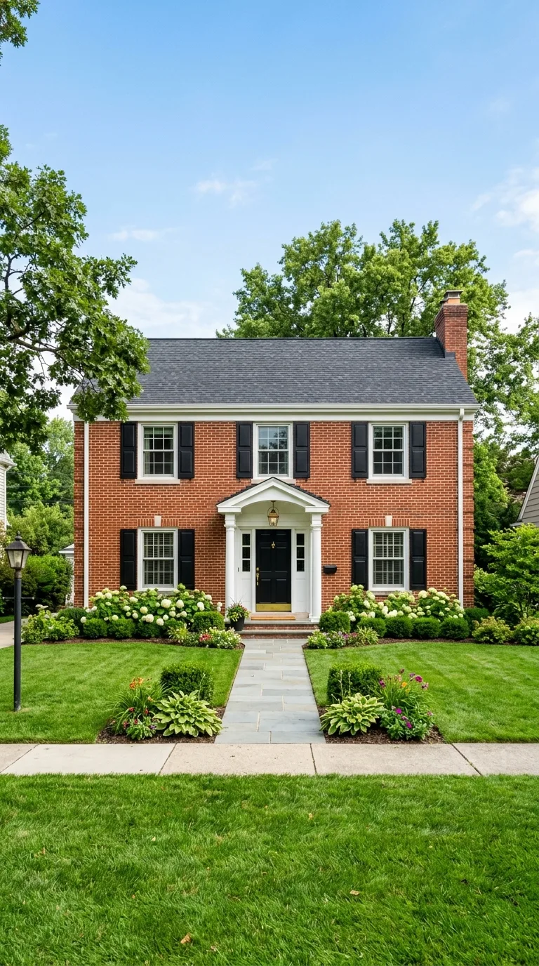
The timeless combination of crisp white trim and black shutters against red brick creates a clean traditional look that never goes out of style and works on virtually every architectural style from colonial to craftsman. The white brightens the overall appearance of the home while the black adds definition and visual weight that prevents the facade from looking washed out or lacking contrast.
This combination works so reliably because white and black are neutral enough to let the brick remain the star while providing the framing that makes the architecture readable from the street. Use a true bright white rather than cream on the trim and a deep matte black on the shutters for the sharpest most polished result that photographs beautifully.
2. Navy Blue Door with Cream Trim
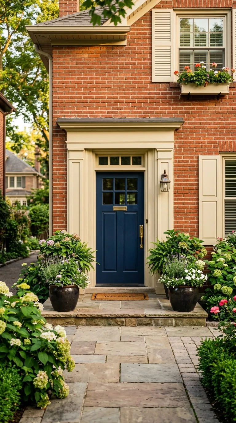
A rich navy blue front door paired with warm cream trim creates a sophisticated look against red brick that feels both classic and slightly unexpected. The blue provides a bold focal point at the entrance while the cream softens the overall palette and bridges the gap between the cool blue and the warm red brick tones creating a harmonious transition across the facade.
Choose a cream with warm undertones rather than a cool white to keep the entire color scheme feeling cohesive and intentional. The navy door becomes the statement piece that draws visitors forward while the cream trim wraps the windows and architectural details in a soft frame that makes the red brick feel rich rather than overwhelming.
3. Sage Green Shutters with Warm Gray Trim
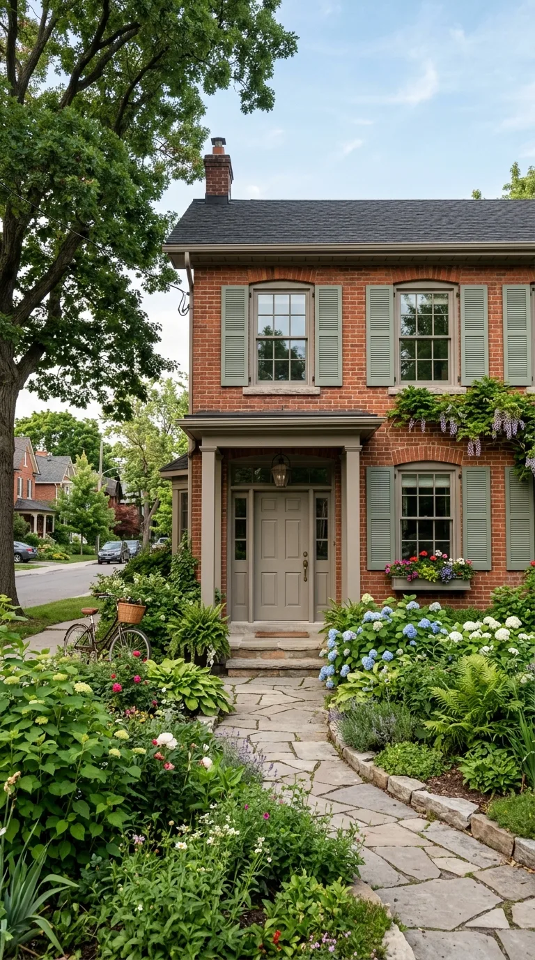
Sage green shutters bring a natural organic quality to a red brick exterior that makes the home feel connected to its landscape and surroundings in a way that few other colors achieve. The muted green complements the earthy red tones of the brick beautifully because both colors exist naturally together in the outdoor environment creating an instinctively harmonious pairing.
Warm gray trim in a shade like greige ties the green and red together by providing a sophisticated neutral that contains subtle warm undertones without competing with either the brick or the shutters. This three color combination feels collected and mature and it works particularly well on homes surrounded by established trees and garden plantings.
4. Charcoal Gray Everything for Modern Contrast
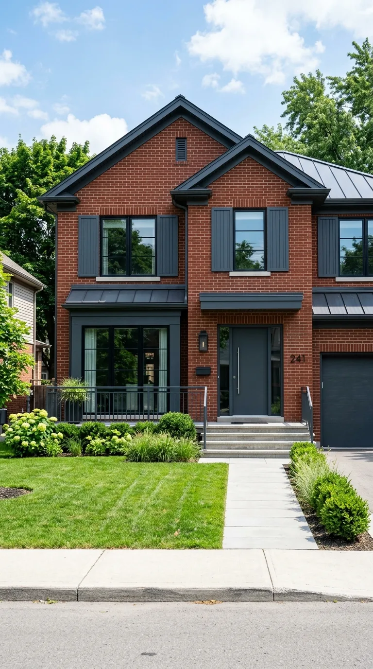
Painting all trim, shutters, fascia, and the front door in a single deep charcoal gray creates a bold modern aesthetic that makes red brick look contemporary and fashion forward rather than dated or traditional. This monochromatic approach to the accent colors simplifies the facade and lets the texture and warmth of the brick become the primary design element with dark framing.
The key is choosing a charcoal that is dark enough to provide real contrast but contains enough warmth to avoid looking cold or harsh against the red tones. A charcoal with brown or taupe undertones works better than a cool blue gray which can make red brick appear slightly orange or clash in certain lighting conditions.
5. Forest Green Door with Tan Trim
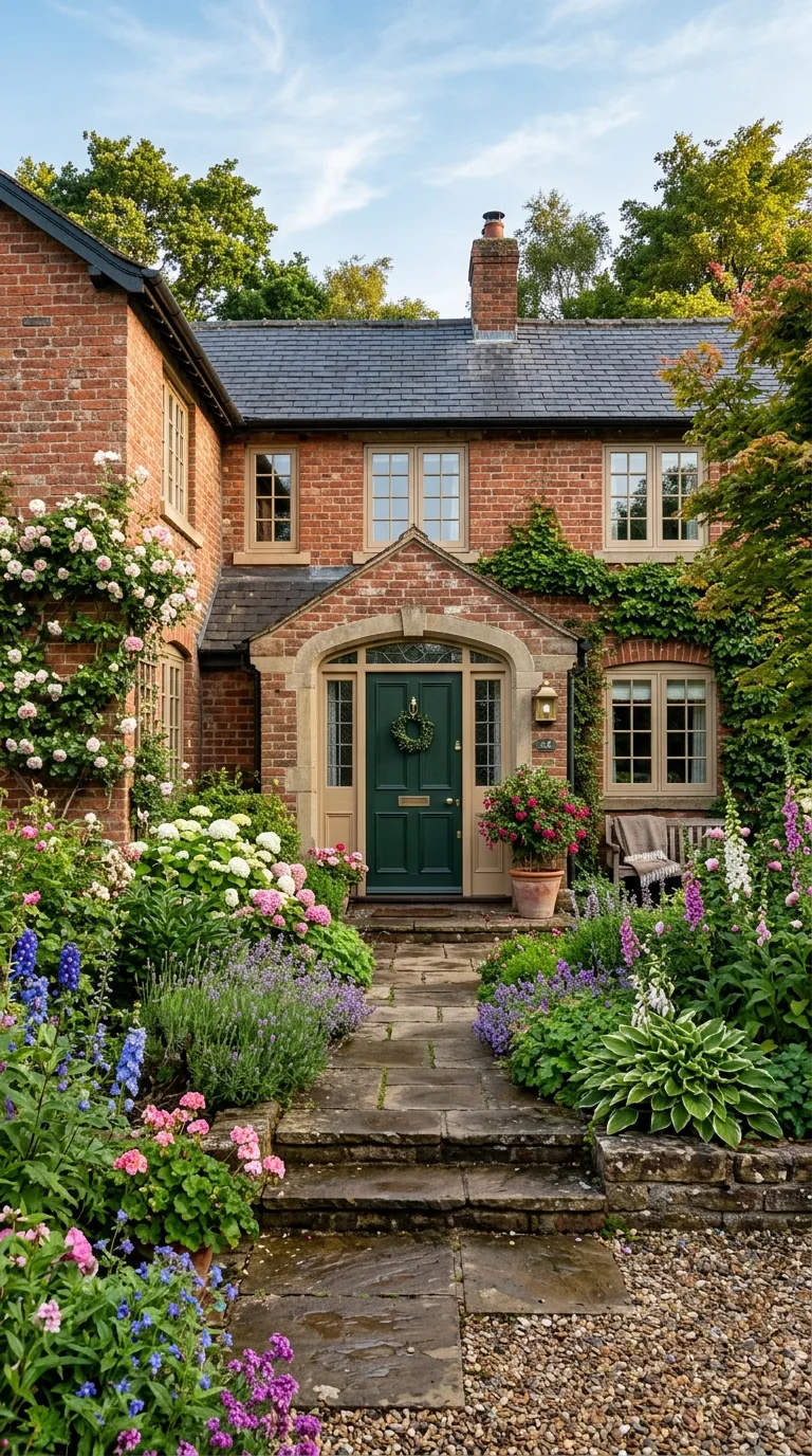
A deep forest green front door against red brick is one of those combinations that feels both surprising and perfectly natural the moment you see it because green and red are complementary colors on the color wheel. The forest shade is dark and sophisticated enough to avoid looking like a holiday decoration while still providing that beautiful complementary energy that makes both colors appear more vibrant.
Tan trim in a warm khaki or sandy tone acts as the peacekeeper between the bold green and strong red brick ensuring the facade feels balanced and grounded rather than visually aggressive. This color scheme has strong roots in English and Georgian architectural traditions which gives it an established pedigree that reads as intentional and educated.
6. All Black Trim for a Dramatic Statement
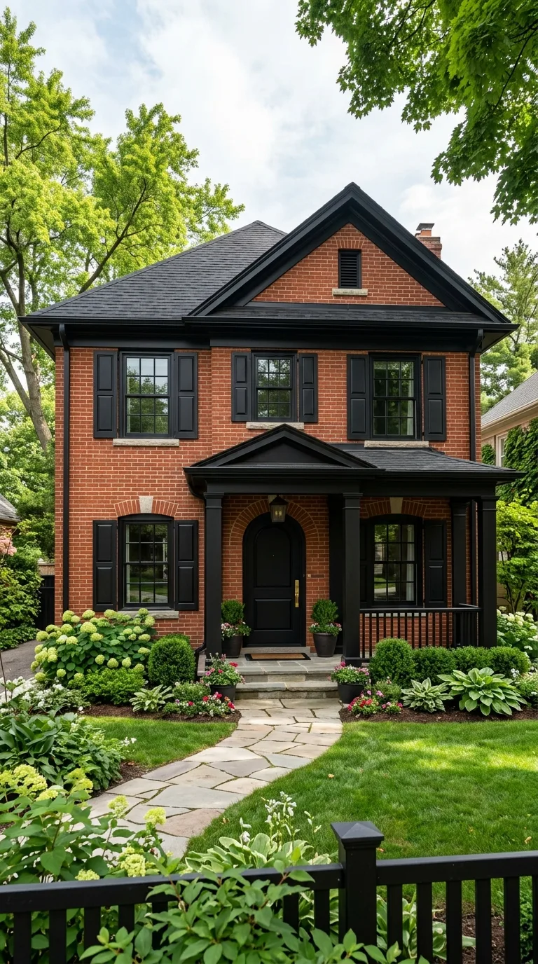
Painting every exterior element in black including trim, shutters, door, fascia, and gutters against red brick creates a striking dramatic look that has become increasingly popular in contemporary and transitional home design. The stark black framing transforms even a modest red brick home into something that looks bold architectural and expensive because the contrast is so clean and decisive.
This approach requires commitment because every detail becomes visible against the dark paint so your trim work needs to be in good condition. The payoff is enormous though because all black accents give red brick a gallery quality presentation that makes the home look like it belongs in a design magazine regardless of its size or architectural complexity.
7. Slate Blue Shutters with White Trim
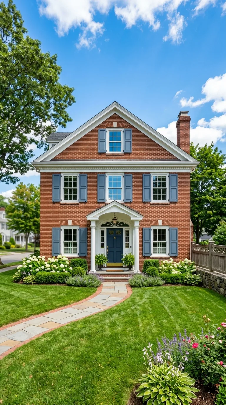
Slate blue shutters bring a cool contrast to warm red brick that creates visual depth and prevents the facade from feeling monotonously warm toned across its entire surface. The blue reads as sophisticated and slightly unexpected while remaining neutral enough to work in traditional neighborhood settings where bold color choices might feel out of place.
White trim keeps the overall look clean and classic while the slate blue provides just enough color personality to distinguish your home from the standard black shutter neighbor. This combination works exceptionally well on colonial and cape cod style brick homes where the architecture benefits from a touch of color without straying too far from traditional expectations.
8. Warm Taupe with Copper Accents
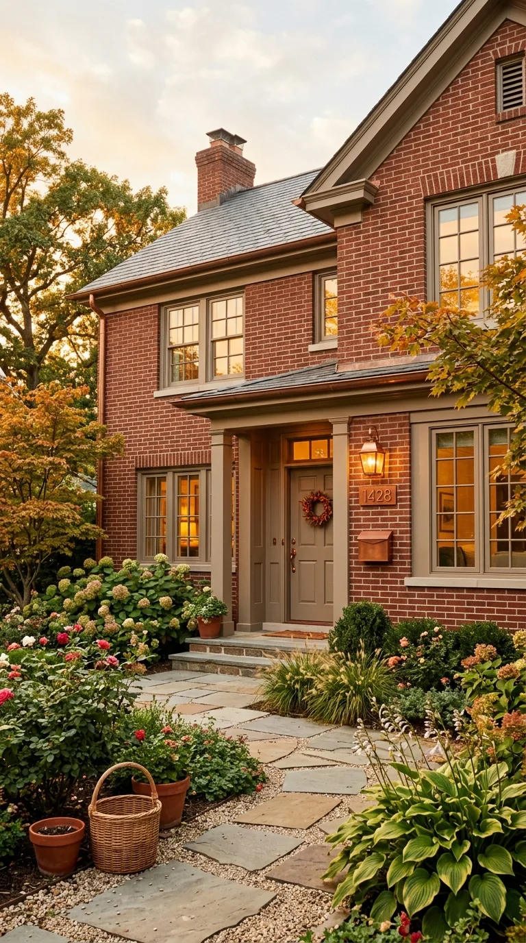
A warm taupe color scheme with copper metallic accents creates a tone on tone approach that enhances the natural warmth of red brick without introducing competing colors. The taupe trim and shutters stay within the same warm color family as the brick itself creating a monochromatic richness that looks expensive and intentionally coordinated from every viewing angle.
Add copper house numbers, a copper mailbox, copper light fixtures, and copper kick plates to elevate the warm palette with metallic dimension. The copper develops a natural patina over time that becomes even more beautiful against the brick and the entire combination ages gracefully together looking better with each passing year rather than dated.
9. Bright Yellow Door with Gray Trim
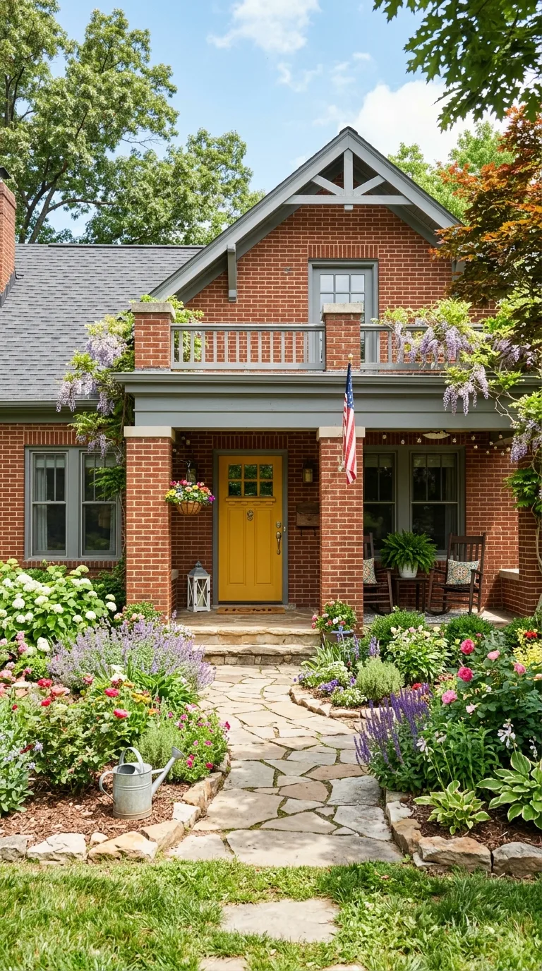
A cheerful yellow front door against red brick makes an unexpectedly delightful statement that radiates warmth and welcome without overwhelming the facade because both yellow and red share warm undertones that naturally harmonize together. Choose a golden mustard yellow rather than a lemon shade to keep the warmth consistent and avoid any jarring cool tones that could clash with the brick.
Medium gray trim in a warm concrete shade provides the neutral frame that prevents the yellow and red combination from feeling too hot or visually chaotic. This color scheme works brilliantly on craftsman bungalows and cottage style brick homes where a playful personality is appropriate and welcomed by the neighborhood aesthetic.
10. Olive Green Trim with Black Door
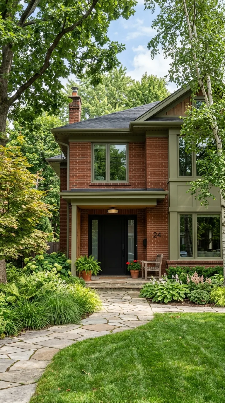
Olive green trim brings an earthy organic sophistication to red brick that feels both modern and timeless at the same time. This deeper muted green has enough brown undertone to relate warmly to the brick while the green hue provides genuine color interest that plain neutrals cannot achieve. It looks especially stunning on homes with mature landscaping where the olive trim echoes the surrounding natural greenery.
A black front door grounds the olive and red combination with a definitive dark anchor that adds weight and formality to the entrance. Together these three elements create a home that looks rooted in its environment and thoughtfully considered rather than arbitrarily painted with whatever colors happened to be on sale at the hardware store.
11. Soft Putty Gray with Burgundy Door
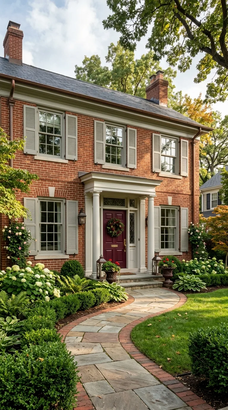
A soft putty gray on all trim and shutters creates a quietly elegant backdrop that lets the red brick texture take center stage while a deep burgundy front door picks up on the darkest tones within the brick itself and amplifies them into a rich focal point. This monochromatic approach feels sophisticated because every color relates back to the brick rather than introducing foreign hues.
The burgundy door works because it reads as a deeper version of the brick color rather than a new competing element. The overall effect is a home that looks expensive and thoughtfully designed with a color palette that evolved naturally from the building materials themselves which is exactly the approach that high end designers take.
12. Teal Door with Warm White Trim
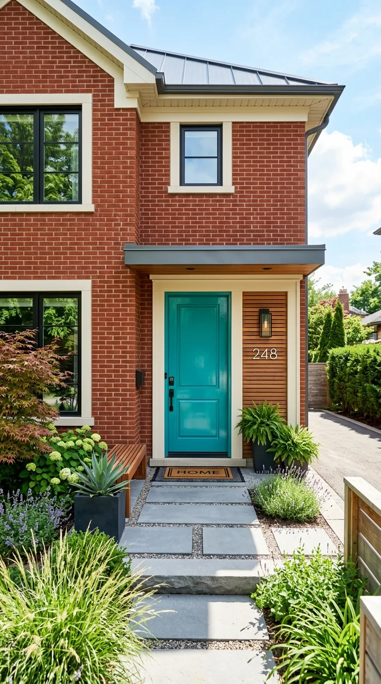
A bold teal front door creates an eye catching contrast against red brick that feels modern artistic and intentional without crossing into garish territory because teal contains enough blue green depth to remain sophisticated. This combination has become a designer favorite in recent years because it bridges traditional brick architecture with contemporary color confidence.
Warm white trim in a shade like Swiss Coffee or Alabaster keeps the overall palette feeling cohesive and inviting while providing enough lightness to frame the windows and architectural details cleanly. The teal door becomes the personality of the home drawing the eye immediately to the entrance and giving visitors a sense of the creative homeowner who lives inside.
13. Pewter Gray Shutters with Red Door
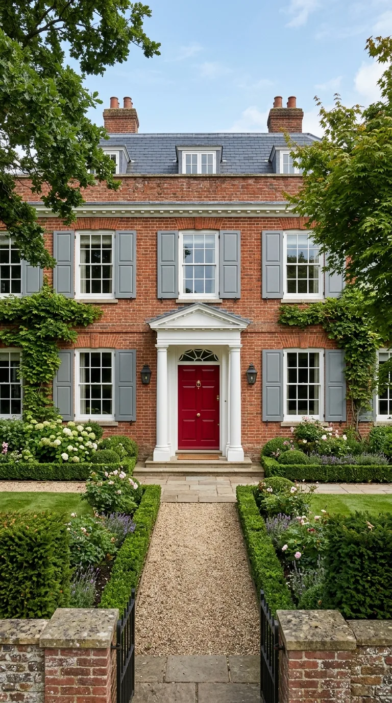
Pewter gray shutters with a bold red front door create a color scheme that confidently embraces the red brick rather than trying to tone it down or apologize for its strong presence. The red door picks up and intensifies the brick tones creating a deliberate monochromatic statement that reads as intentional and bold rather than mismatched or accidental.
The pewter gray provides just enough cool contrast to prevent the red on red combination from feeling flat or one dimensional. This scheme works particularly well on Georgian and federal style homes where a red door carries historical significance and the gray shutters provide the formal neutral framing those architectural styles traditionally require.
14. Pale Blue Gray with Bronze Hardware
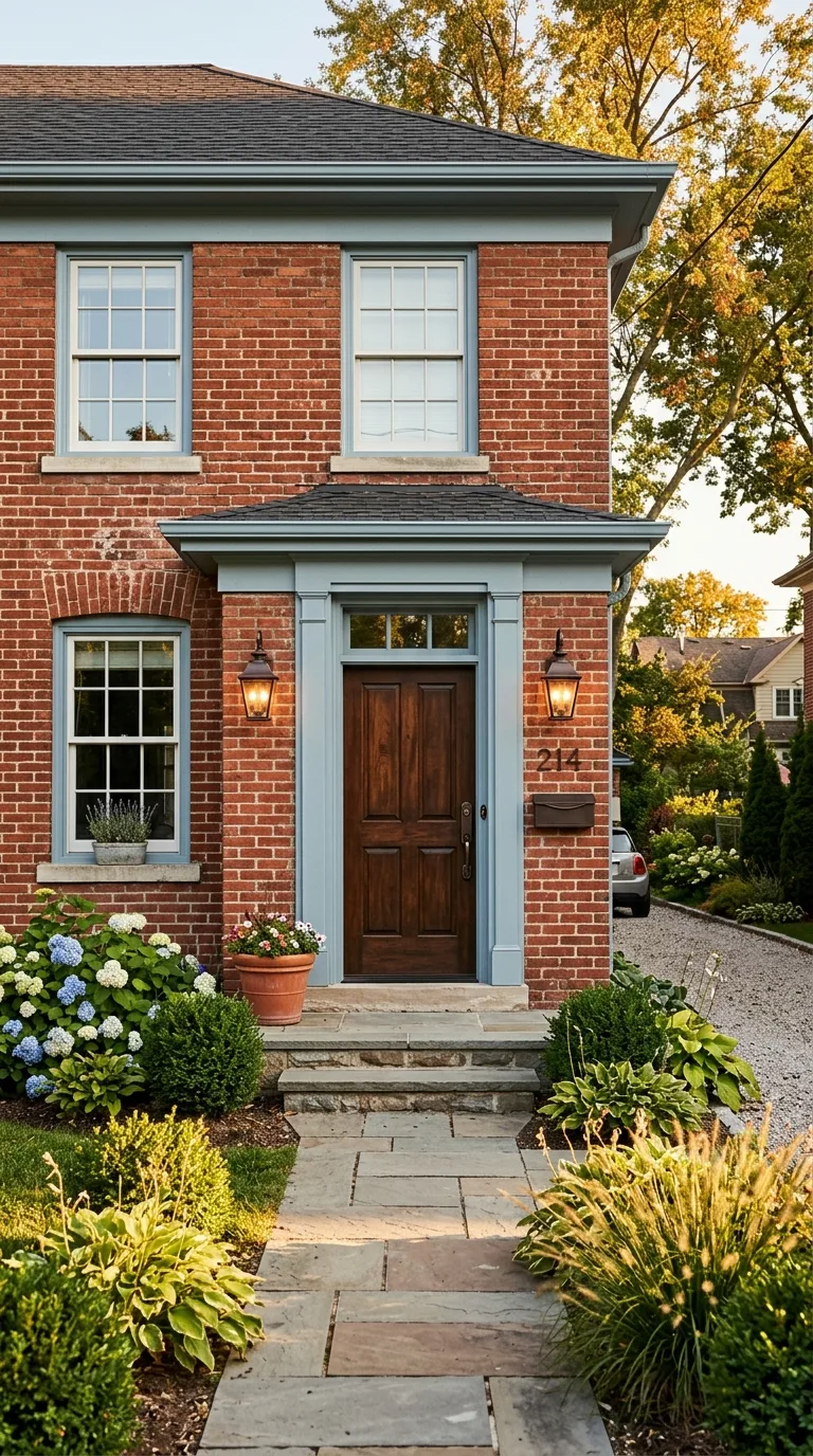
A pale blue gray across all painted surfaces creates a cool contemporary contrast that makes red brick feel fresh and updated rather than old fashioned or heavy. The soft blue gray contains just enough warmth to avoid feeling cold against the brick while providing a genuinely different tonal quality that creates visual interest and depth across the facade.
Bronze or oil rubbed bronze hardware, light fixtures, and house numbers add warmth back into the palette through metallic accents that bridge the cool trim and warm brick beautifully. This combination looks particularly stunning in late afternoon light when the warm sun illuminates the blue gray paint and makes the bronze fixtures glow with reflected warmth.
15. Chocolate Brown Trim with Gold Accents
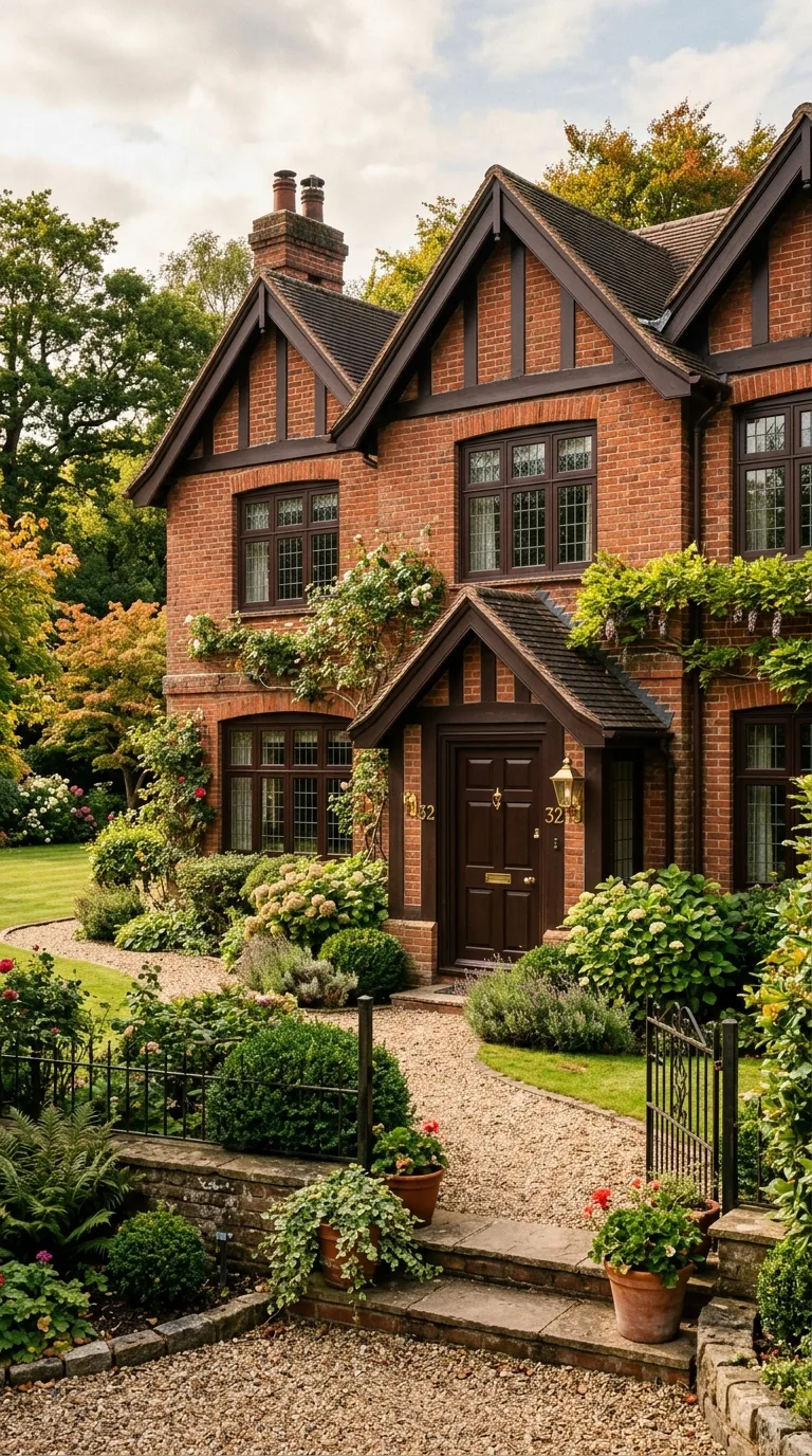
Dark chocolate brown trim creates a rich tonal harmony with red brick that makes the entire home feel warm enveloping and substantial. Because brown and red share warm undertones the combination feels naturally unified like different shades within the same family rather than separate colors competing for attention. The effect is a home that looks like it was built from a single coordinated material palette.
Gold accents through house numbers, light fixtures, door hardware, and a gold toned kickplate add a touch of luxury that elevates the earthy palette into something genuinely elegant. This combination has strong English manor house energy that works beautifully on Tudor and traditional style red brick homes.
16. Soft Pink Door with Light Gray Trim
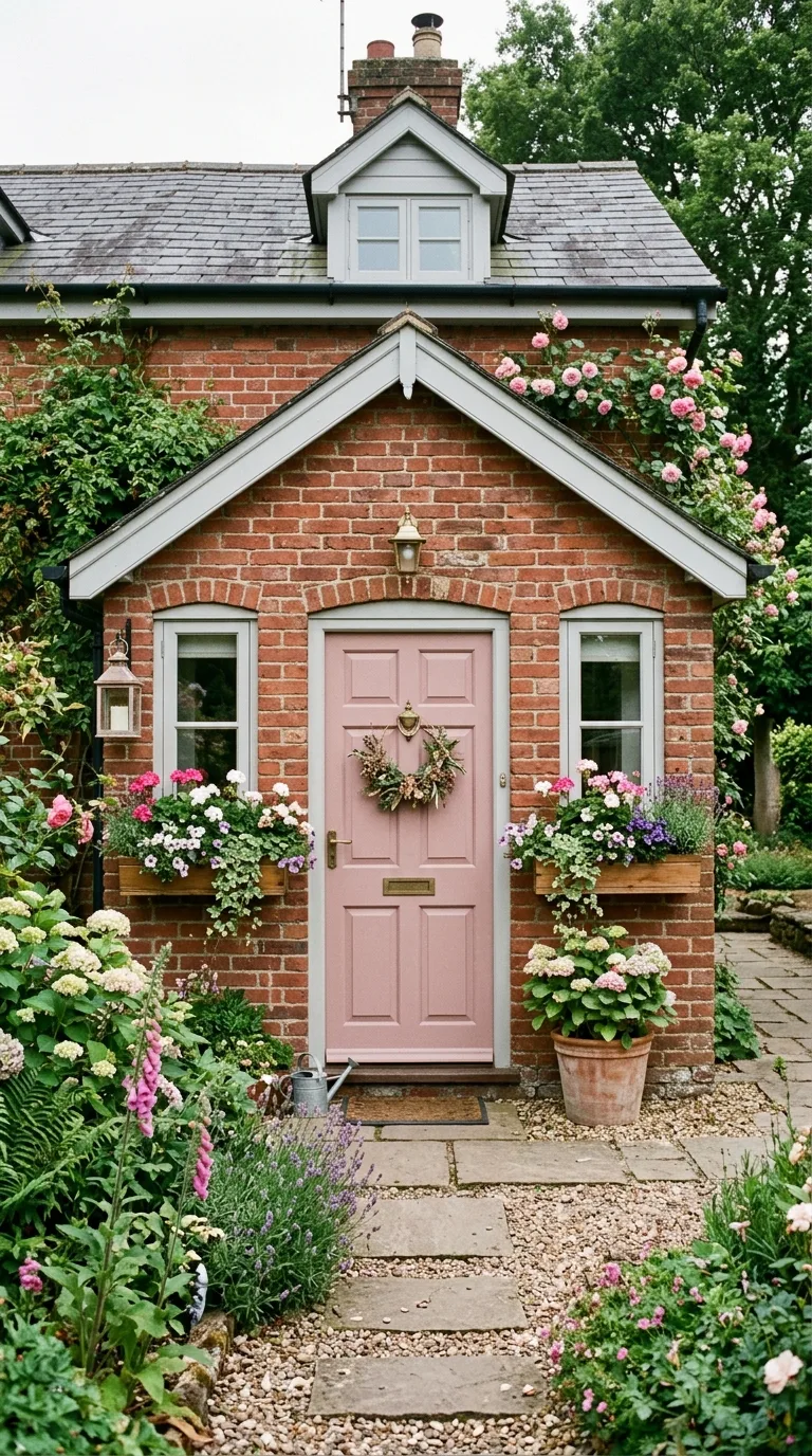
A soft dusty pink front door might sound unusual against red brick but in practice it creates a beautiful tonal echo that feels romantic sophisticated and utterly unique on a residential street. Choose a muted blush or dusty rose rather than a bright bubblegum shade to keep the look elegant and grown up. The pink relates to the red brick without matching it creating subtle visual dialogue.
Light warm gray trim provides the neutral foundation that keeps the pink from feeling too sweet or precious and gives the overall facade a modern sensibility. This color scheme works wonderfully on cottage style and victorian brick homes where a touch of romance and personality is welcome and expected.
17. Black and White Graphic Contrast
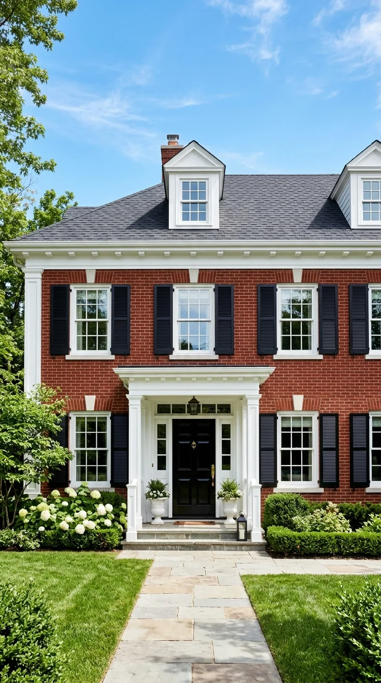
Pairing pure white trim with a jet black door and black shutters on a red brick house creates maximum graphic contrast that looks sharp decisive and architecturally bold. This high contrast approach works on virtually every brick home style and it photographs extremely well which matters increasingly in an era where curb appeal includes how your home looks on real estate listings and social media.
The simplicity of using only black and white ensures the color scheme never looks dated or trendy because these are permanent neutrals that transcend any particular decorating era. It also provides the most flexibility for seasonal decor and landscape color because black and white complement absolutely everything you might plant or display near the entrance.
18. Eucalyptus Green with Natural Wood Tones
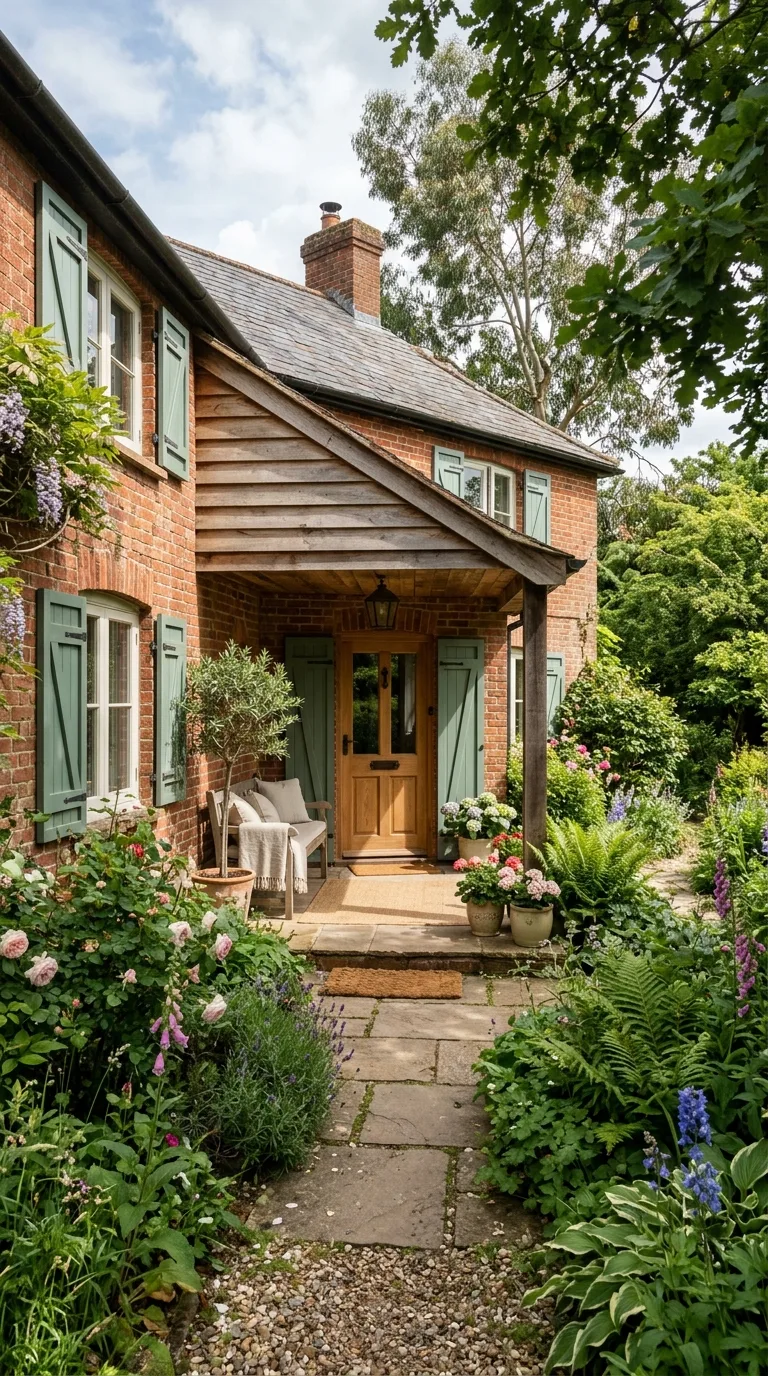
A soft eucalyptus or sage green on shutters and trim combined with natural wood tones on the front door and porch ceiling creates an organic palette that makes a red brick home feel like it grew naturally from its surroundings. The combination of green, wood, and brick contains nothing synthetic or arbitrary because these are materials and colors found together in nature.
Use a clear sealed natural wood for the door rather than a painted surface and consider a natural wood ceiling on the front porch to extend the organic warmth overhead. This color scheme suits homes with mature gardens, large trees, and natural stone hardscaping where the architecture should feel integrated with rather than imposed upon the landscape.
19. Pale Lavender Door with Dove Gray Trim
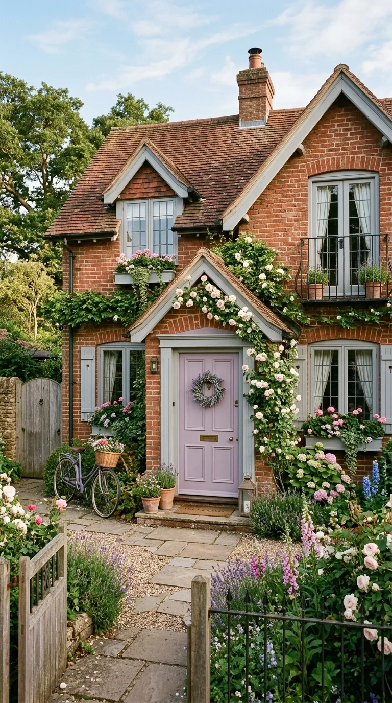
A muted lavender or soft purple front door provides an unexpectedly beautiful complement to red brick because purple contains both the cool blue tones that contrast the brick and the warm red tones that harmonize with it. This duality makes lavender one of the most versatile accent colors for brick homes though few homeowners think to try it.
Dove gray trim in a soft warm shade keeps the overall palette subdued and elegant while letting the lavender door serve as a gentle statement piece. This combination has a slightly french country quality that works beautifully on brick homes with arched doorways, window boxes, or other romantic architectural details that welcome softer color choices.
20. Warm White Monochrome with Brass Details
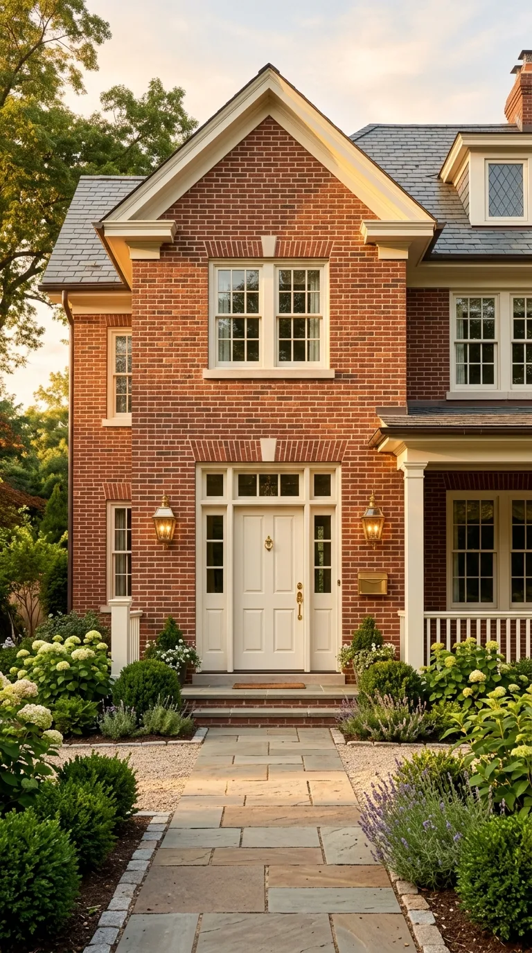
Painting all exterior elements in a single warm white creates a serene monochromatic frame that makes the red brick texture the undisputed hero of the facade with absolutely nothing competing for attention. This minimal approach looks incredibly sophisticated on homes with beautiful brickwork patterns or interesting bond layouts that deserve to be showcased without colorful distractions.
Brass door hardware, light fixtures, house numbers, and a brass mail slot add just enough warmth and luxury to prevent the white from feeling stark or clinical. The combination of warm white, red brick, and brass has a classic upscale quality that works on everything from a small brick rowhouse to a large suburban colonial.
21. Terracotta Accents with Ivory Trim
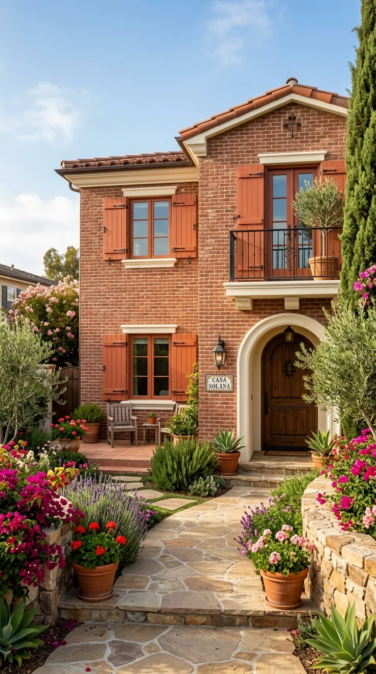
Using terracotta colored accents on shutters or the front door creates a warm earthy extension of the brick color palette that makes the entire facade feel cohesive and Mediterranean inspired. The terracotta is close enough to the brick to belong to the same family but different enough to read as a distinct design choice that adds dimension and intentional layering.
Ivory trim rather than bright white softens the transitions between the terracotta accents and the red brick avoiding harsh contrasts in favor of a warmer more enveloping color story. This palette looks especially beautiful on spanish revival, tuscan, or ranch style brick homes where warm earth tones feel architecturally appropriate and historically grounded.
22. Dark Plum Shutters with Light Stone Trim
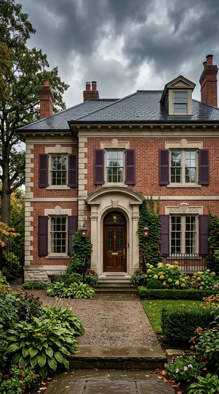
Dark plum or aubergine shutters bring a moody richness to red brick that feels dramatic and luxurious without veering into darkness that makes the home look unwelcoming. The purple undertones in plum relate naturally to certain red bricks that contain violet and blue flashing making the combination feel instinctive and connected rather than random.
Light stone colored trim in a warm limestone or sandstone shade grounds the plum and brick combination with a natural element that feels architectural and substantial. This palette works beautifully on homes with actual stone accents around windows or at the foundation where the trim color can reference real materials already present on the exterior.
23. Seafoam Green Door with Charcoal Trim
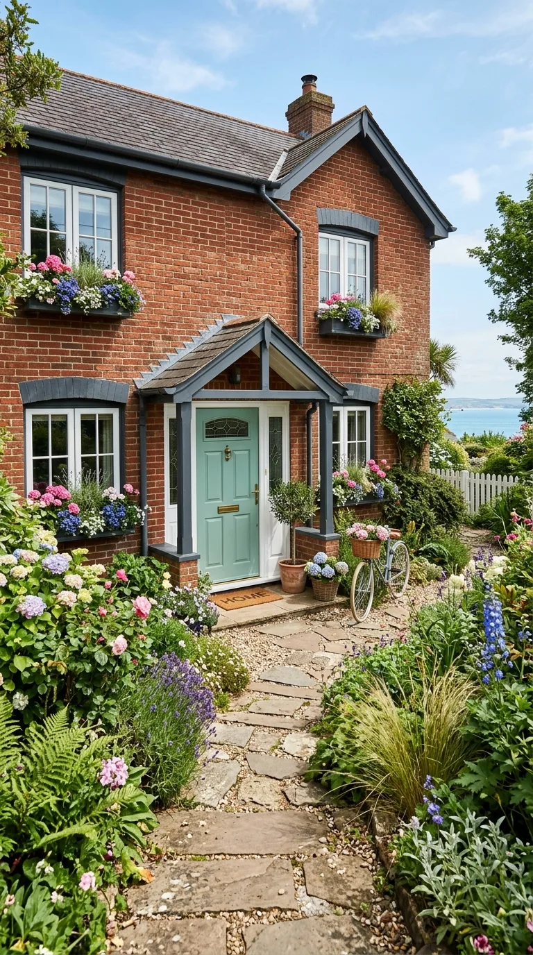
A seafoam or soft aqua green front door creates a refreshing coastal contrast against red brick that brightens the entire entrance and gives the home an unexpectedly relaxed welcoming personality. This color works because it sits opposite red on the color wheel providing natural complementary contrast while the softened muted shade keeps it from feeling garish or juvenile.
Charcoal trim provides the dark sophisticated frame that grounds the playful door color and prevents the overall look from feeling too casual or unserious. This combination appeals to homeowners who want their red brick home to feel approachable and friendly rather than formal and imposing and it works particularly well in coastal or temperate climates.
24. Mushroom Taupe with Matte Black Modern Details
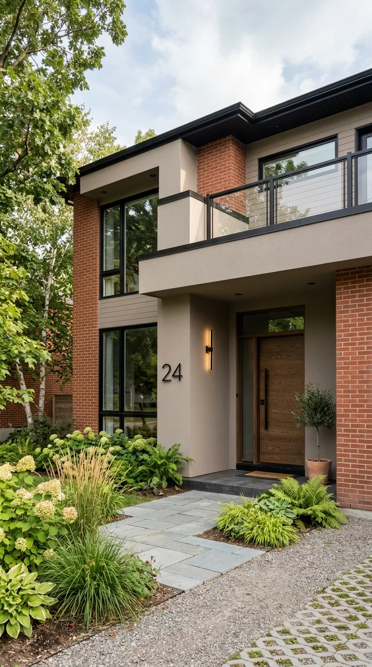
A warm mushroom taupe on all painted surfaces combined with matte black modern hardware and fixtures creates a contemporary organic palette that makes red brick feel current and design forward. The mushroom tone is warm enough to harmonize with the brick while being neutral enough to disappear into the background letting texture and material quality speak rather than color.
Matte black house numbers in a modern font, black steel light fixtures, a black metal planter, and a black framed glass door panel add contemporary edge to the warm organic base. This combination bridges traditional brick architecture and modern design sensibility perfectly for homeowners who appreciate both heritage materials and current aesthetic trends.


